Onboarding new devices
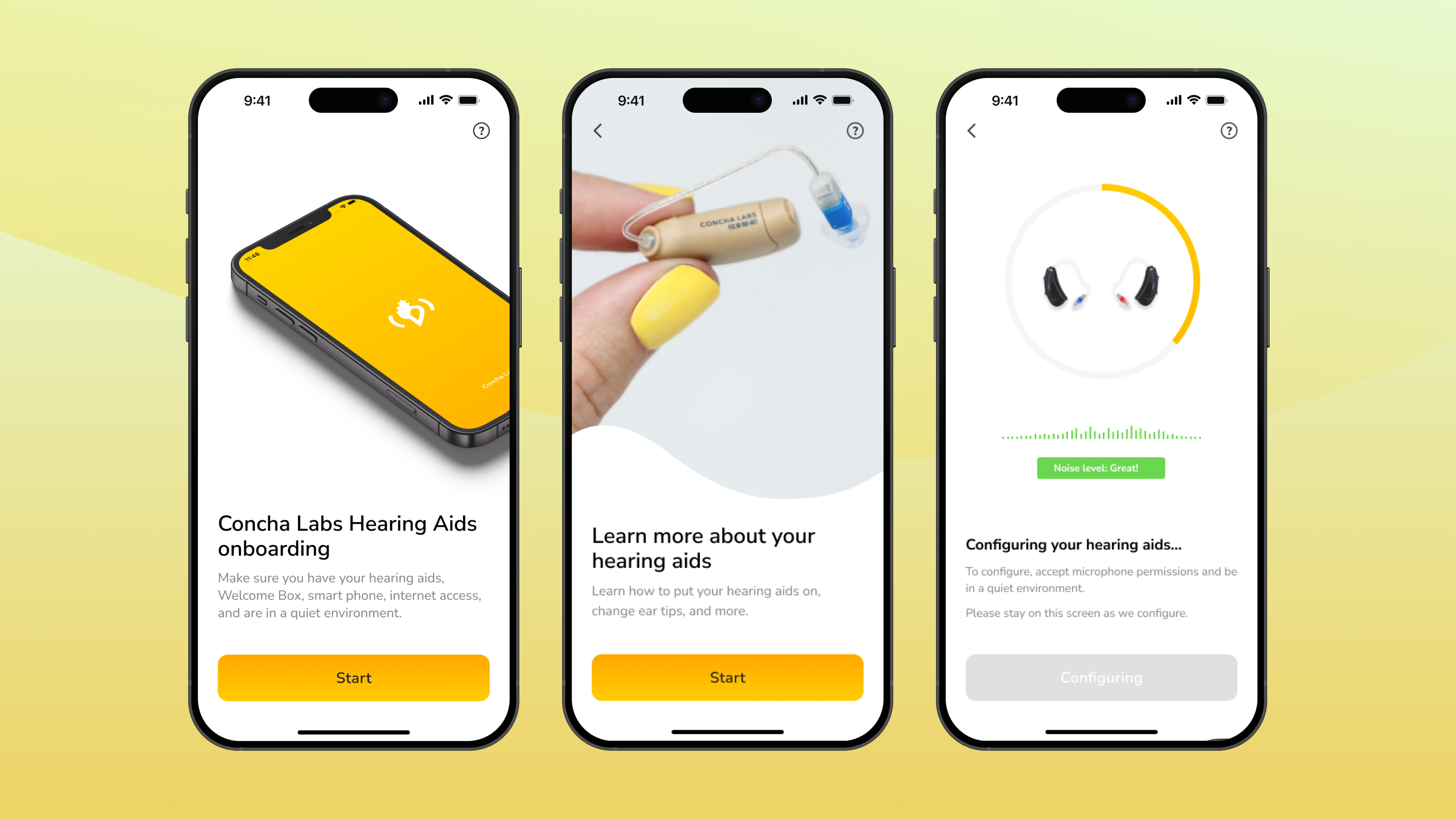
This case study focuses on creating an onboarding experience for new and familiar users who bought our Concha Sol Hearing Aids.
Concha Labs
Background and mission
The Concha Labs™ App is a hearing aid app that allows users to personalise their hearing straight from home. Our users must purchase our hearing aids, download the app, and then take Soundscope® in order to receive their personalised sound profiles. The hearing aids are Over-The-Counter (OTC) FDA approved.
The problem
The problem
When I joined the team in 2021, the app designs were just a draft on Figma and there was no onboarding. We needed to create an onboarding experience, because whenever users buy our hearing aids, they must connect them to their iPhones through iOS’ MFi connection and Bluetooth. We had many things to consider when designing this experience:
Onboarding is the first impression of the app, so the experience needed to be as seamless as possible to prevent any returns.
- How do we empower hearing aid users during this experience?
- How do we lead users through the process without excessive hand-holding?
- How do we design for a medical device, while still creating a fun and intuitive onboarding experience?
- How do we make onboarding familiar and simple for new and familiar users?
Onboarding is the first impression of the app, so the experience needed to be as seamless as possible to prevent any returns.
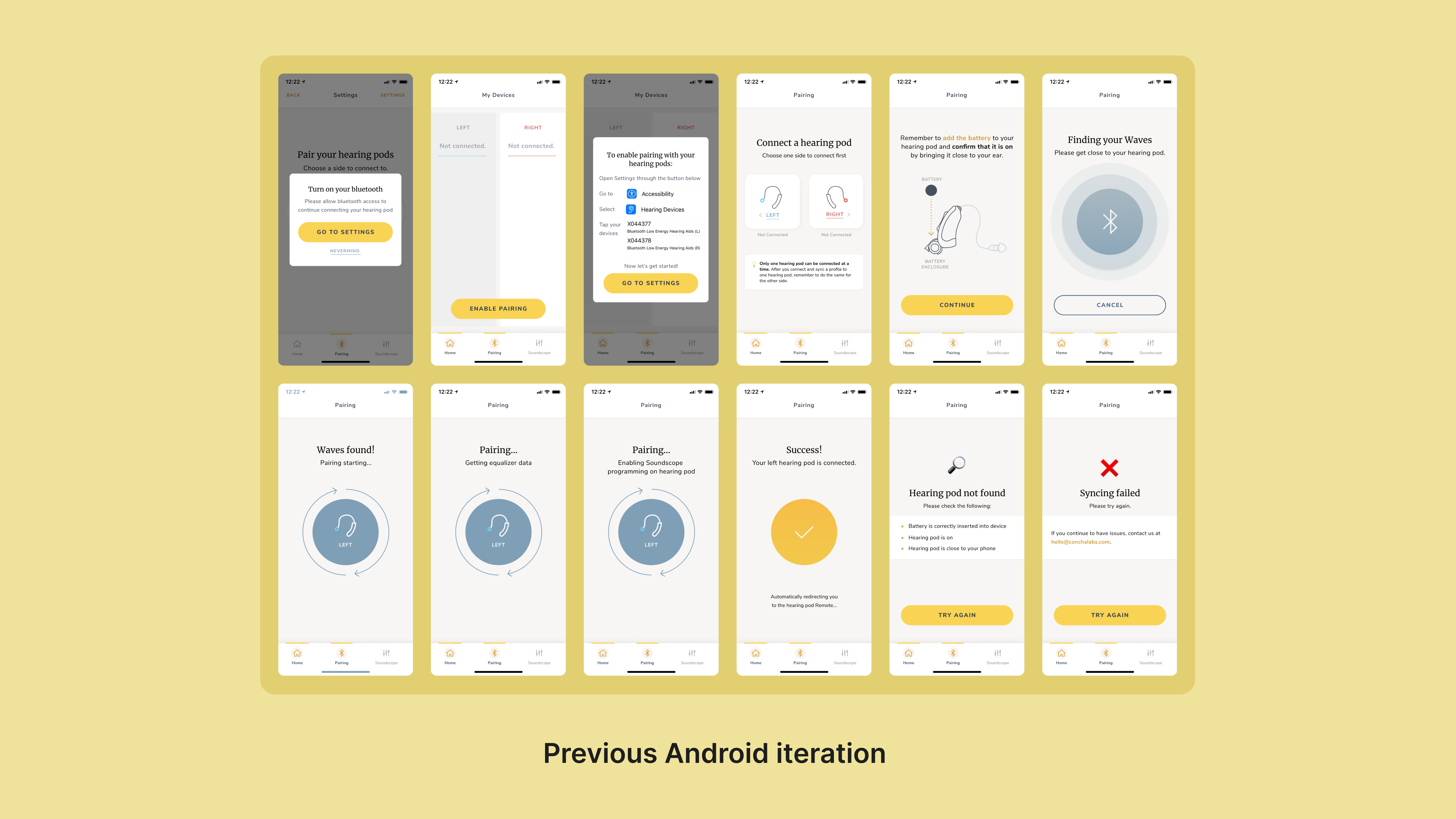
These are the previous Android iterations of the app. Users had to onboard each hearing aid separately, and the visual language of the app felt unfinished and like a wireframe.
The problem (cont.)
When I joined, we had drafts of Android designs from the previous designer. We learned that we switching from Android to iOS, which would change the entire app and affect onboarding greatly due to the pairing process. Previously, users onboarded each hearing aid separately, but with iOS and updated hardware, we could connect both left and right hearing aids, which cut down onboarding time immensely.
My job was to tackle the problems of:
My job was to tackle the problems of:
-
Creating an onboarding experience.
-
Transition the app from Android to iOS.
- Re-design our visual language.
Ideation + brainstorming
Ideation and brainstorming
I led a brainstorm session with the iOS team to discuss any pain points and features that may be impacted. These sessions are always fun, because everyone has a variety of thoughts which allows us to make something amazing in the end!
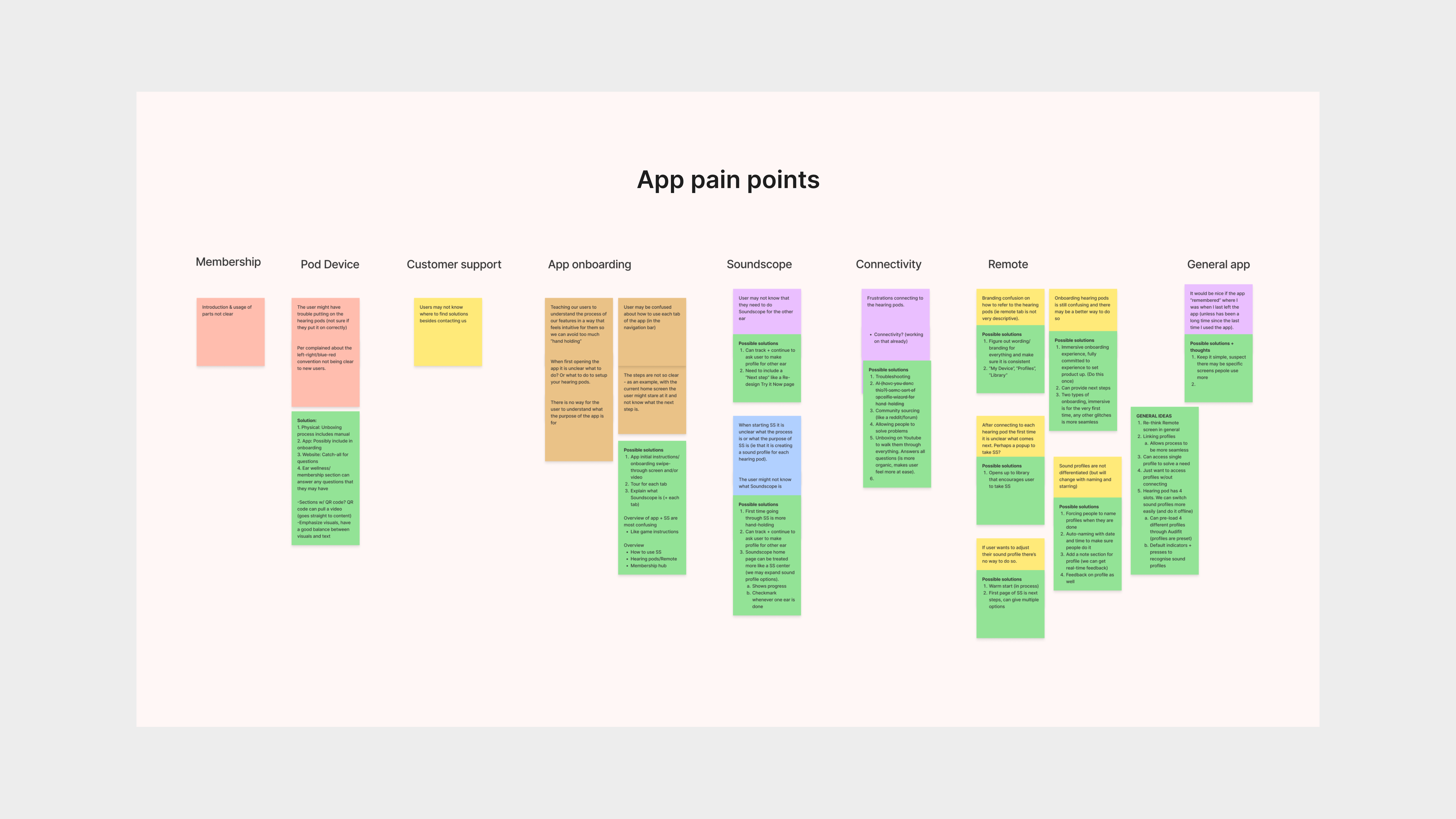
We set a timer and had our team put down as many pain points they could think of! We then categorised the stickies, discussed general resolutions, and ranked their priority.
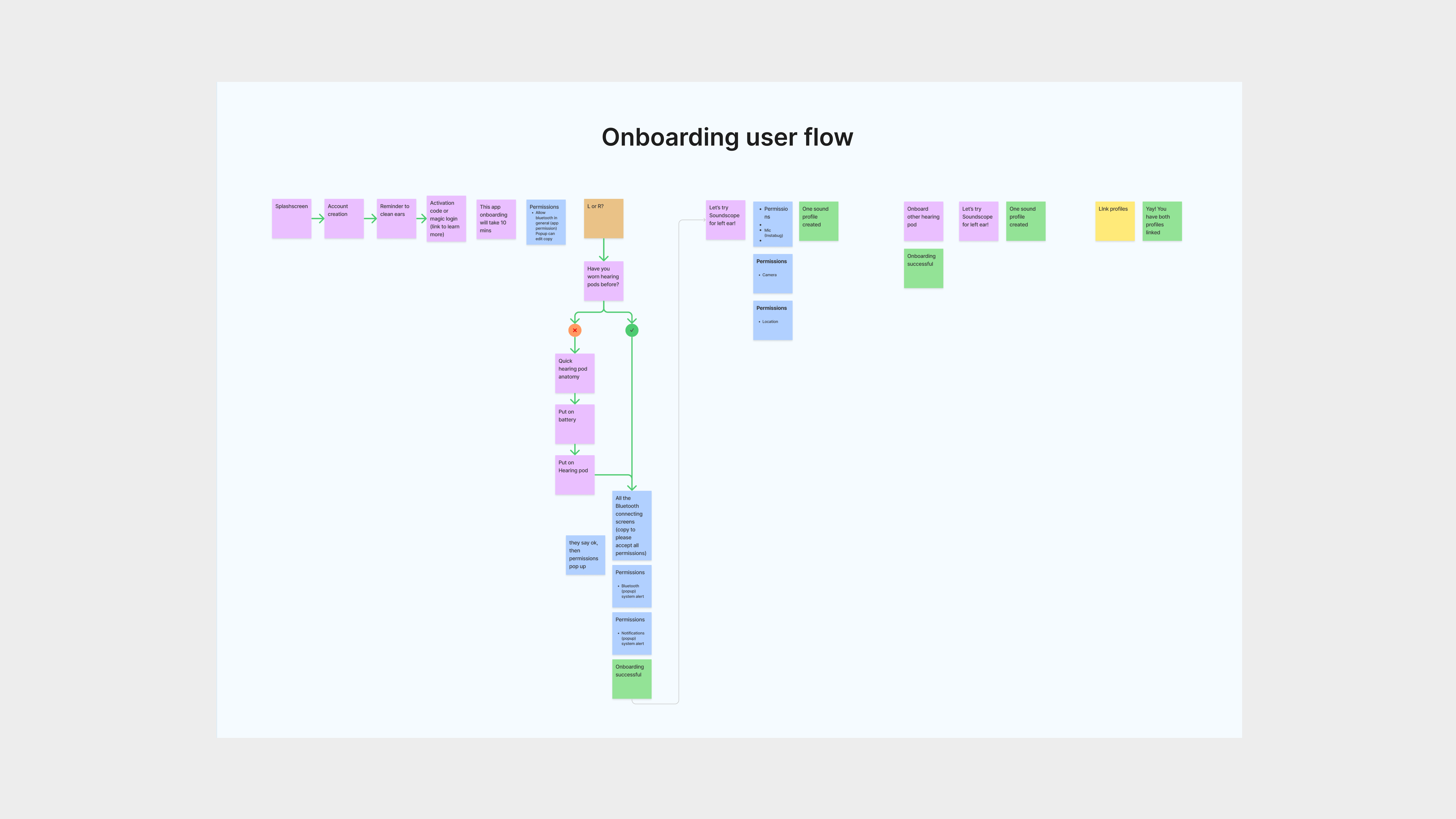
We spent another meeting working on a rough draft of the onboarding user flow, based on our own experiences, ideas, and referencing the Android designs. It was important to me that we innovated our own user flow first before research, to document our ideas without influence.
Market research
Market research
We researched and studied how our direct competitors implemented onboarding to compare and take note of current innovations. We also researched large hearing aid companies to make sure that we met industry standards. While every hardware works differently, it was helpful to see how every company designed differently around their product’s attributes.

Comparing specific sections, such as the pairing section, was helpful to see how they took users through the Bluetooth pairing flow.
![]()
We also noted some design that we liked, such as Audifon’s visual display of hearing aids, Eargo’s searching waves, Signia’s reminder, and Audifon’s tour.
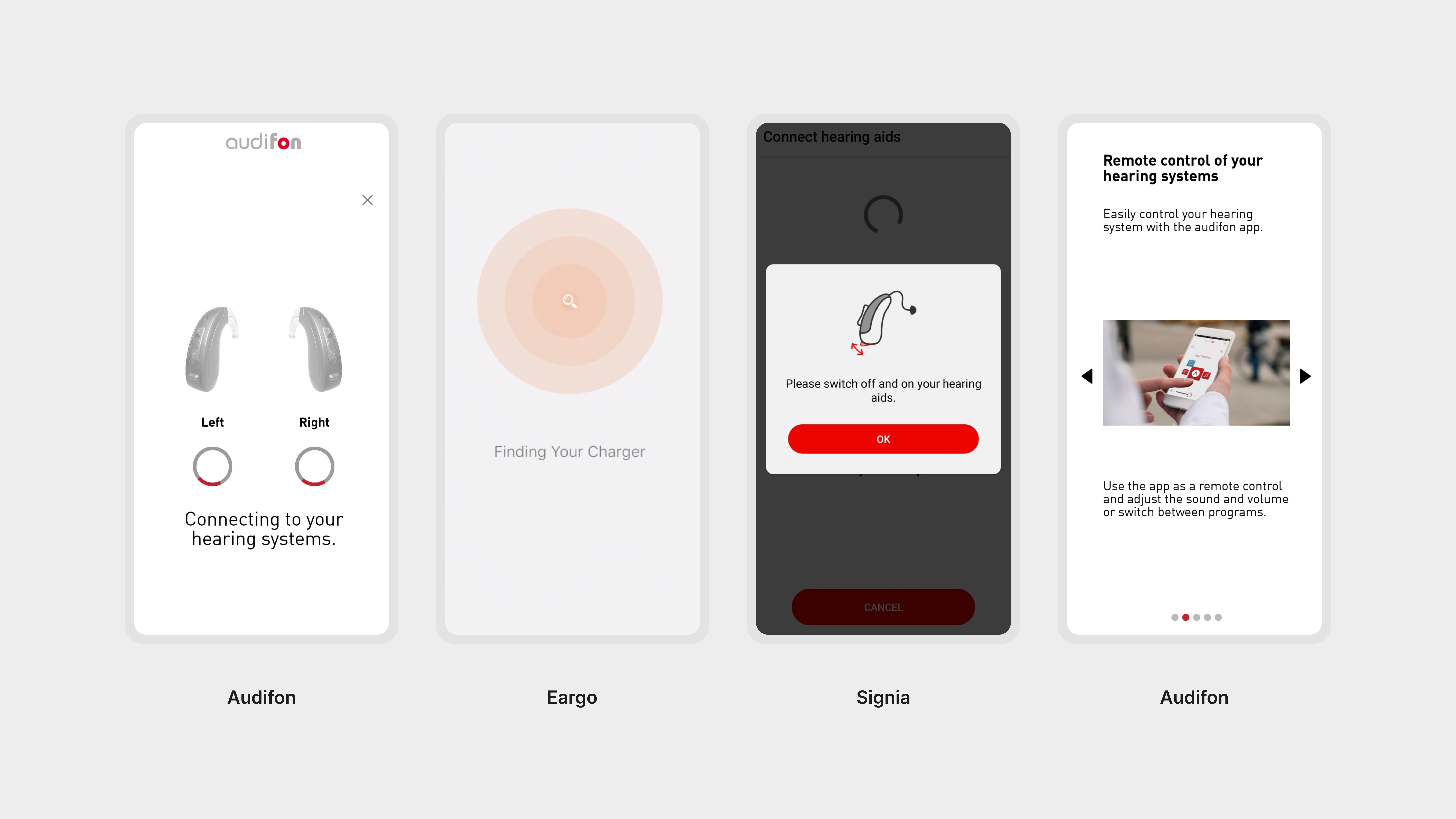
We also noted some design that we liked, such as Audifon’s visual display of hearing aids, Eargo’s searching waves, Signia’s reminder, and Audifon’s tour.
Market research (cont.)
The design of these hearing aid apps often felt very outdated and seemed to target only an elderly audience. We wanted our represention in the hearing aid space to be refined, modern, and inclusive of all audiences.
I took some notes on what we could do:
I took some notes on what we could do:
- More models/photos of hearing aids: Depicting our product accurately with photos and models develops trust with our users. Visuals are important, since our users have hearing loss.
- Minimal branding: Overwhelming branding can overpower design. I have a “less is more” approach, so when branding elements are in play, they make a bigger impact.
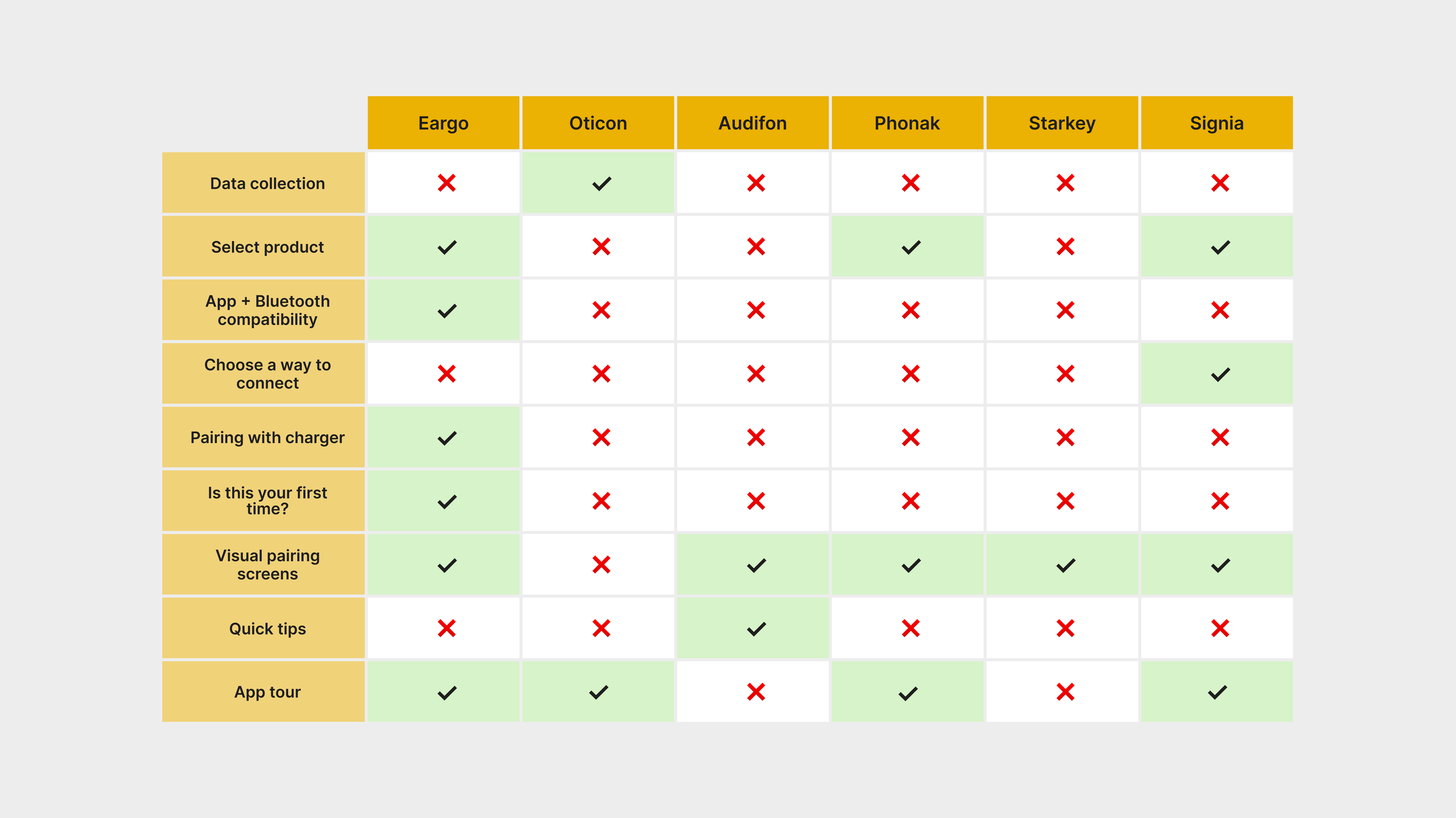
I compared the onboarding process from competitor hearing aid companies to see what they prioritised. Though this was helpful, we kept in mind how their product differs from ours!
Market research (cont.)
Through the comparison chart I noted things I needed to include, such as:
The prescription hearing aid companies often did not have information on how to use the hearing aids, likely due to an audiologist in-office sharing that information. Because we were a B2C business, our users skip the audiologist process and can personalise from home. Every hearing aid is different, and I wanted new and familiar users to have a safe and informative experience using our hearing aids.
To resolve for this, I included a short tutorial section for the most important hearing aid knowledge, for safety reasons, and created a help section on the website with video and written tutorials.
- Bluetooth pairing request
- Permissions (microphone, camera, etc)
- Troubleshooting
The prescription hearing aid companies often did not have information on how to use the hearing aids, likely due to an audiologist in-office sharing that information. Because we were a B2C business, our users skip the audiologist process and can personalise from home. Every hearing aid is different, and I wanted new and familiar users to have a safe and informative experience using our hearing aids.
To resolve for this, I included a short tutorial section for the most important hearing aid knowledge, for safety reasons, and created a help section on the website with video and written tutorials.
Switch to iOS + creating the user flow
From Android to iOS
While these design changes were fun to focus on, the biggest change in this project was the switch from Android to iOS. Previously, users had to onboard each hearing aid separately. With more research and time, now we could finally onboard both hearing aids at the same time.

Users had to repeat pairing and configuration twice, even if they only needed one hearing aid. This was difficult because it allowed for many troubleshooting issues, and was very long.
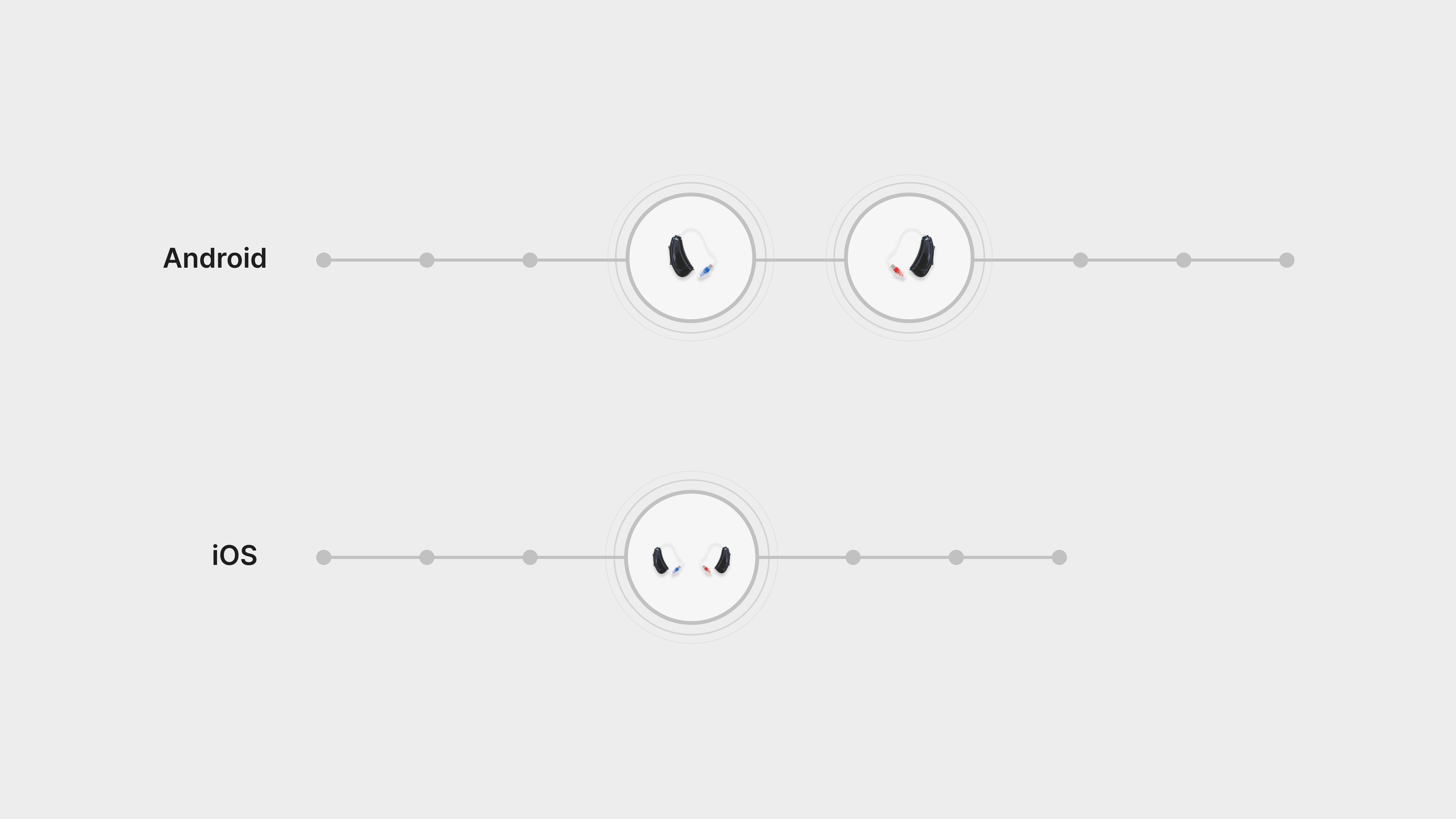
Connecting the hearing aids and pairing them together shortened onboarding!
Creating the onboarding user flow
After looking through our own draft of the onboarding flow and our market research, the iOS team got together to map out our high-level onboarding flow to start with. Our goals with the user flow were:
- Keeping it simple and efficient
- Having onboarding be quick
- Educational for first time and familiar users
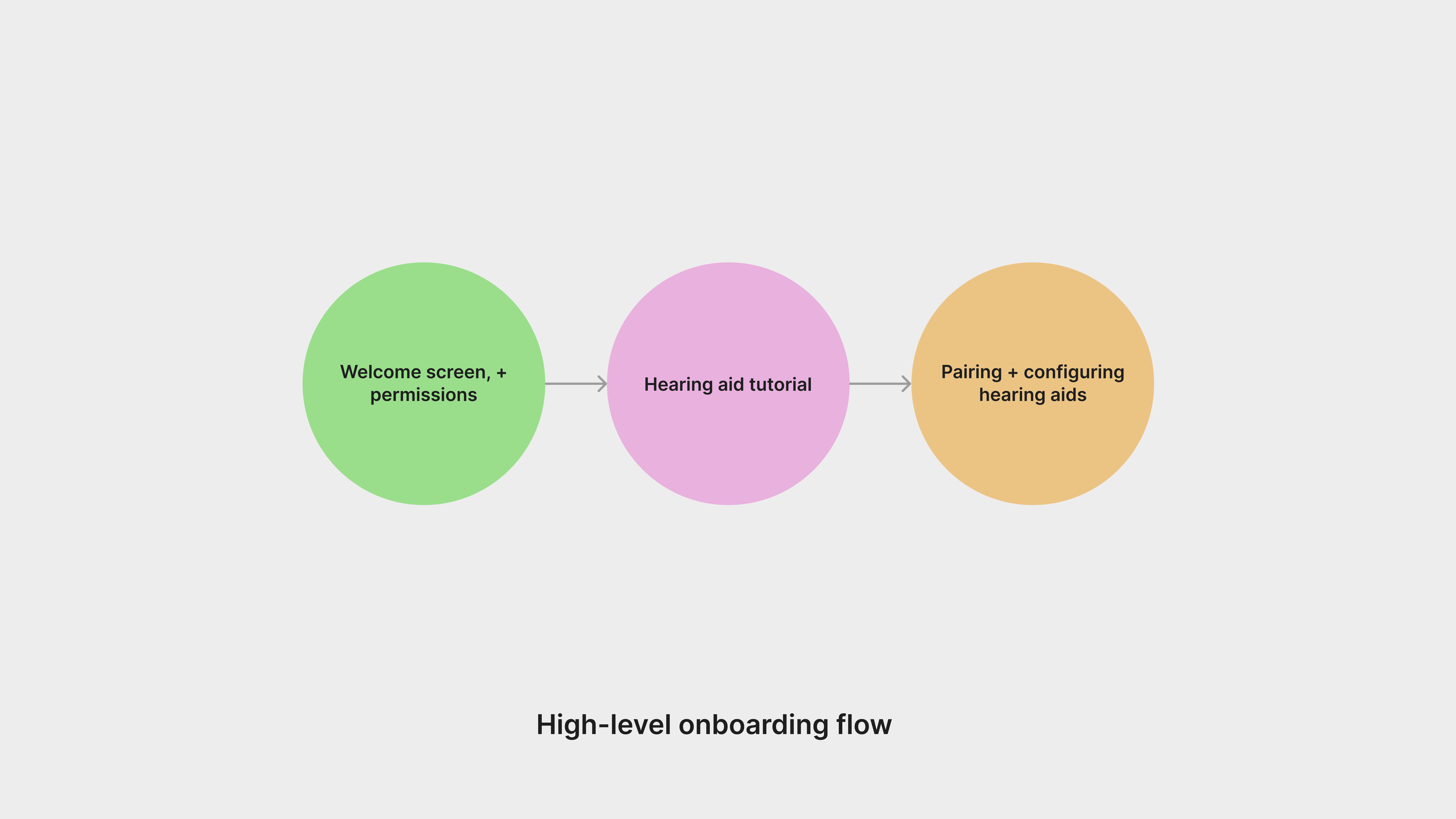
We came up with a general high-level onboarding flow that highlighted all of the major steps that new users will have to go through.
![]()
We mapped out the details of this user flow, which we continued to edit throughout the process.

We mapped out the details of this user flow, which we continued to edit throughout the process.
Creating the onboarding user flow (cont.)
After looking through our own draft of the onboarding flow and our market research, we came up with a high-level onboarding flow that tackled some issues that we resolved by:
- Educating new and familiar users with our hearing aids and how they work. Every hearing aid is different, and our users needed to know the basics of how to power on their hearing aids before the next step.
-
Pairing and configuring the hearing aids, which requires a quiet environment.
Initial explorations + design research
Initial exploration and first drafts
While the process for every project varies, for this project I began the initial exploration by making small and quick edits to the Android designs, to see how I felt about the existing elements. I made quick changes in the following screens such as:
- Turning the hearing aids inwards to feel centered
- Switching from square to circle hearing aid buttons to be on brand
- Removing the top header and bottom navigation
- Enhancing Bluetooth searching waves

Sometimes a complete re-design can be daunting! For this case, I eased myself into the re-design by playing with existing elements to see what their potential was.
Design research
I like to do another round of research for inspiration, especially for the design phase, to make sure that the final designs are current. Since hearing aids are audio-based devices, it made sense to look at other hearing devices, such as earphones.
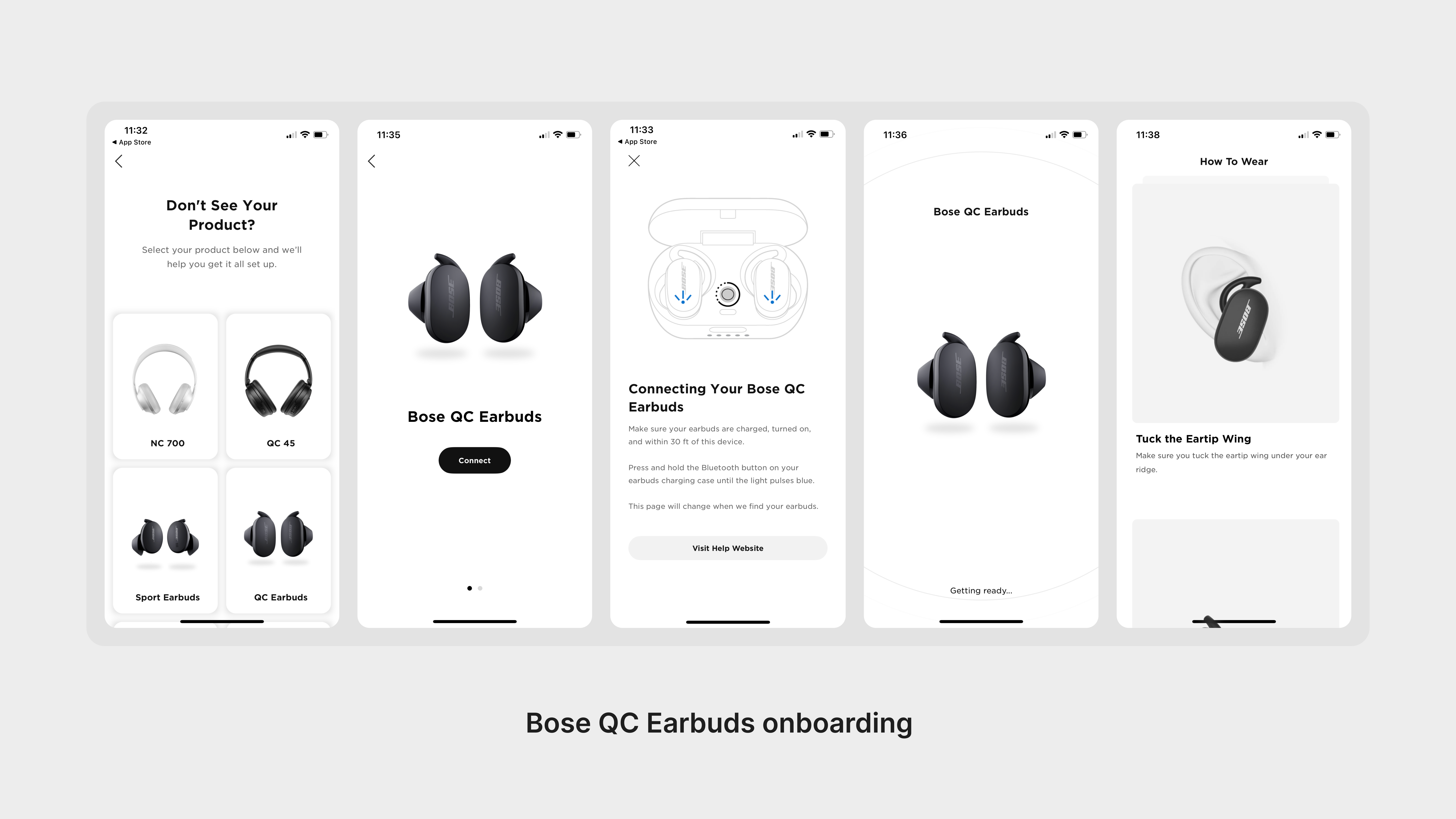
Design research (cont.)
What I mainly learned from Bose’s onboarding was that they balanced showing vs telling. Since hearing aid users are hard-of-hearing, it was important to make sure they had clear visuals and copy to onboard their hearing aids correctly.
From these designs, we took some notes on what we liked.
We were excited to incorporate these notes into our final designs!
From these designs, we took some notes on what we liked.
- A foundation of grayscale for a more simple design
- Clean product photos
- Simple text hierarchy
- Minimal branding elements
We were excited to incorporate these notes into our final designs!
Refinement in design
After playing around with the initial design style, I was ready to do an overhaul. With notes taken from research, there were some design elements I made adjustments such as:
These simple changes made a huge difference on the design of the app!
- Modernizing elements, such as editing button styles from rounded corners to a smaller border radius
- Formulating a simple text hierarchy with left aligned text at the bottom of each screen.
- Changing the background from grey to white
- Images of the product and people to increase trust and a sense of community
- Grayscale base with colour when needed, to focus on the onboarding process itself
These simple changes made a huge difference on the design of the app!

This is an example of both combining the hearing aids for pairing, and also designing for onboarding!
Beta + usability testing
Internal Beta testing
The customer support team ran a beta program of 39, from the ages of 18 to 75. The process of receiving feedback involved
During this process, the customer support team and QA engineer would collect feedback and ideas and have meetings with me and key stakeholders, and create action items from those meetings.
- A 1-hour unboxing/onboarding call with a member from customer support, our QA engineer, and a member of the iOS team. During this call they would ask questions and document feedback.
-
Customer support schedules a follow up call for more feedback, after the users has used the app for some time.
- We additionally have Instabug, so users can directly send feedback or ideas through the app.
During this process, the customer support team and QA engineer would collect feedback and ideas and have meetings with me and key stakeholders, and create action items from those meetings.
Beta testing feedback and how we resolved it
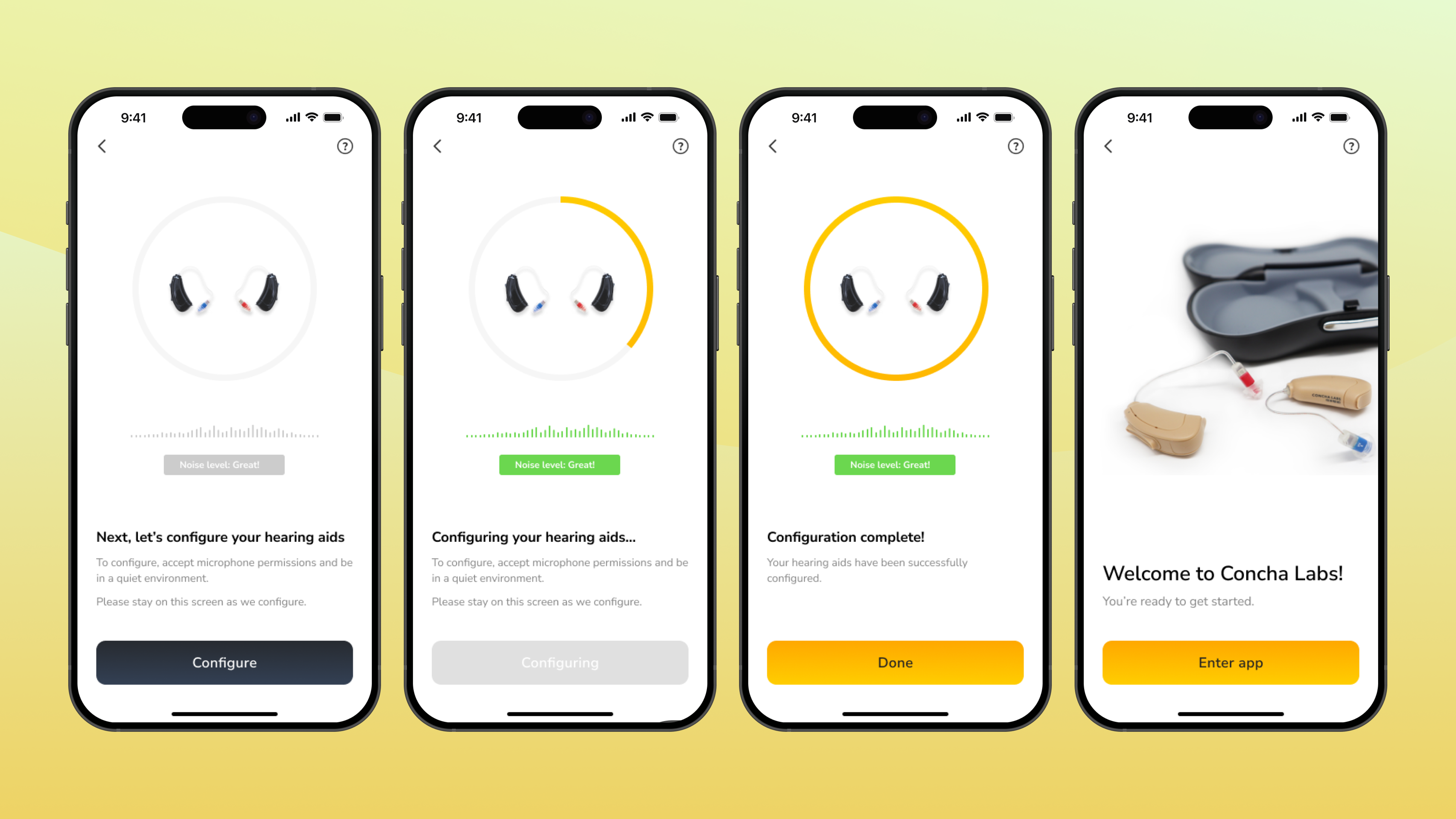
One major issue we learned from beta testing, was during our configuration: we learned that despite letting our users know that they need to be in a quiet environment, they would not understand why or would at times talk over configuration. We needed a way to let our users know that they had to be in a quiet environment, so I researched some ideas and options. With our findings, our team landed on creating a noise detection tool because:
I designed a noise detection tool that became red and had amplified visuals when the background was too loud, and included copy to ensure that it was extra clear.
- Animated visuals to help users to understand if they are in a quiet or loud environment
- The visuals also demonstrate the importance of being in a quiet environment
I designed a noise detection tool that became red and had amplified visuals when the background was too loud, and included copy to ensure that it was extra clear.
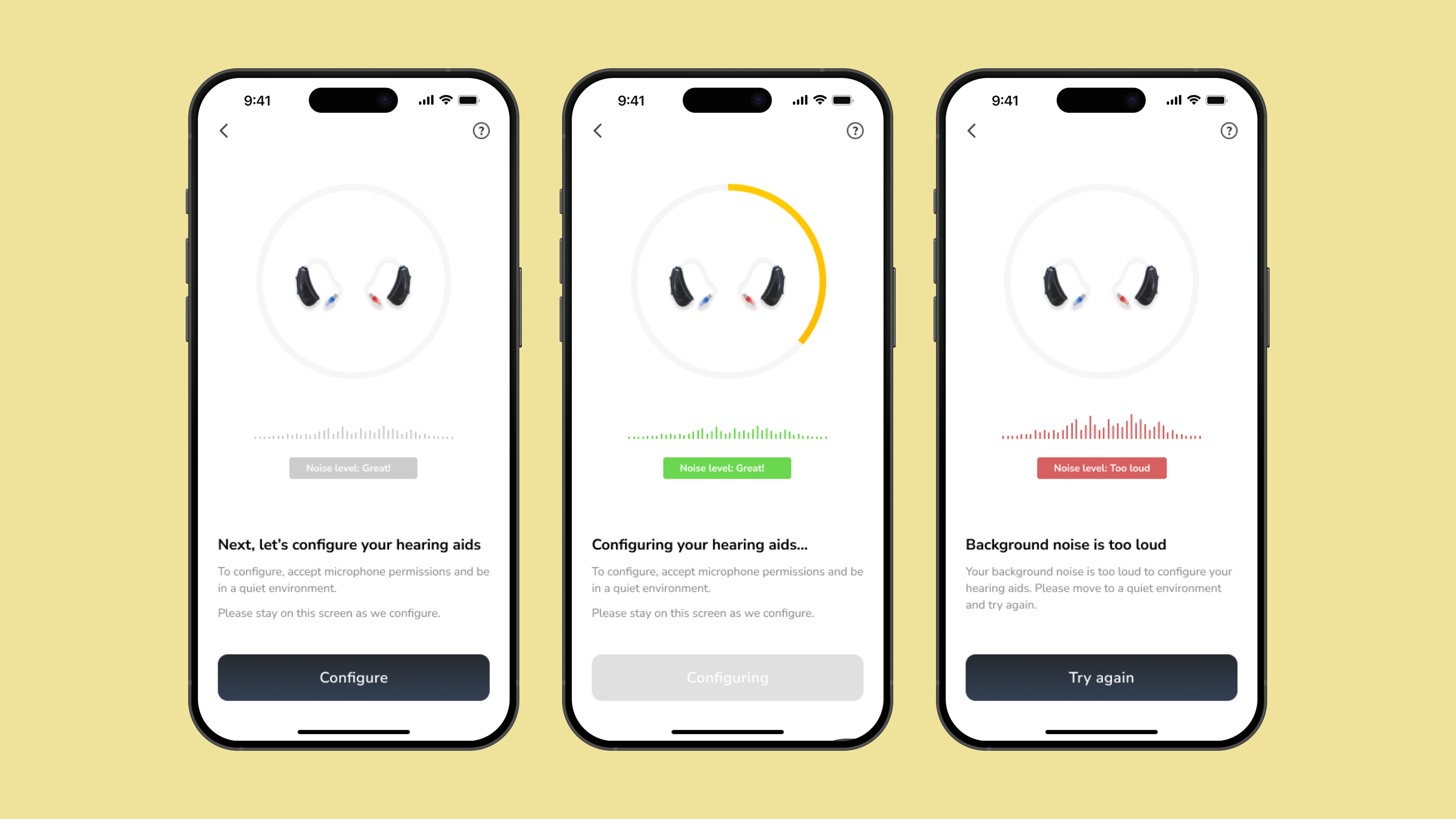
This simple tool allowed our users to understand the importance of being in a quiet environment.
FDA Usability Testing
During the summer of 2023, we sent our 510k submission to the FDA, which is a premarket submission that demonstrates whether our product is safe, effective, and most importantly, works. We
After our submission was approved we went through FDA Usability Testing, which involved observing 15 participants unbox, onboard, and use our product for an hour each. Our customer support team documented the participants’ feedback and brought them back to the team for further discussion, after the testing was over.
The Concha Labs™ App and Concha Sol Hearing Aids were FDA approved and were officially Over-The-Counter (OTC) hearing aids as of March 2024!!
Key takeaways
User error vs app error
During the process of both beta testing and usability testing, we needed to determine whether the feedback given was a user error versus an app error. For example, even though we improved our configuration process to remind users to be in a quiet environment, some people still talked through configuration due to the product being something they set up from home and not set up by an audiologist. OTC hearing aids are still newer in the hearing aid space, thus some people do need to adjust to the process, specifically older users.
User bias
We had some users who were a lot more interested in the product and gave specific feedback often. We appreciated their interest in testing our product, and had to keep in mind their background while gathering information to move forward with what feedback to prioritise. To keep the user bias in check, our customer support team went through every beta video to synthesise what the main issues were. It was important to determine whether the feedback was an actual blocker through looking at data and patterns within all of our users.
The final designs
The final designs
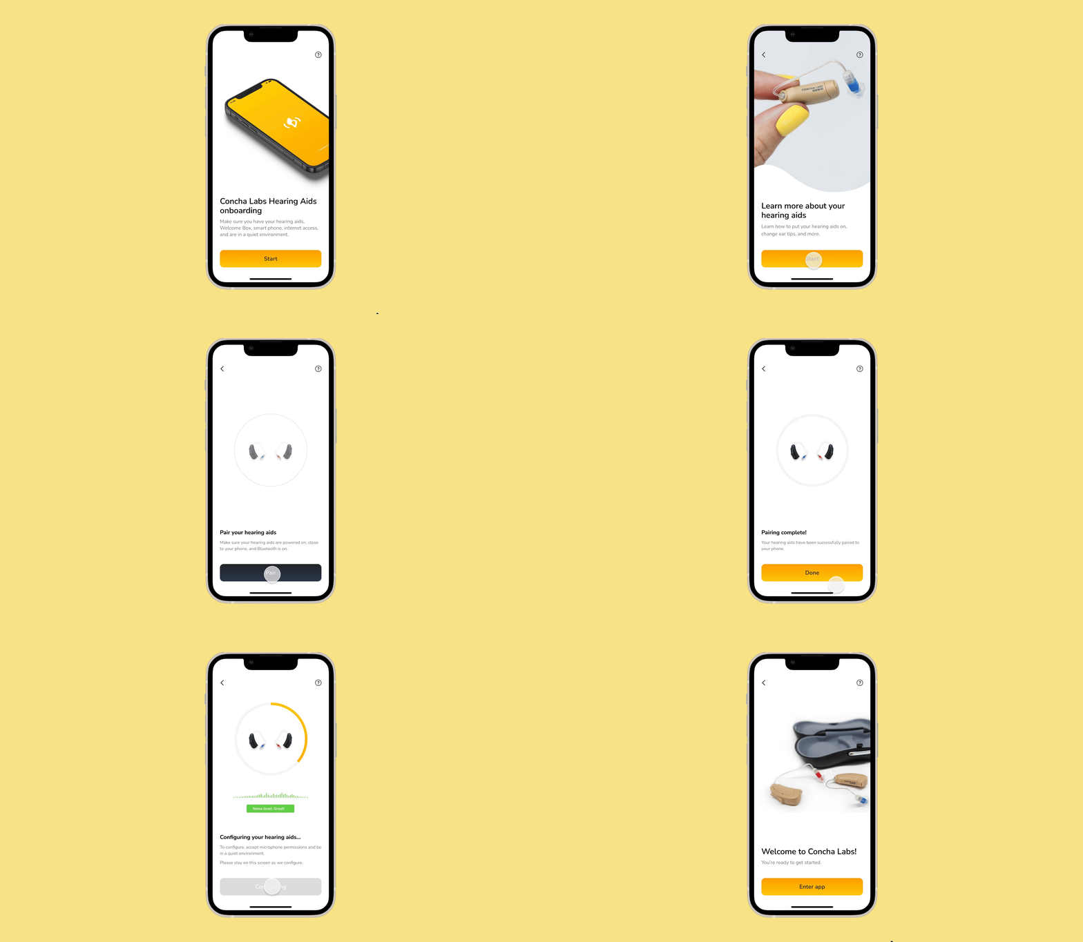
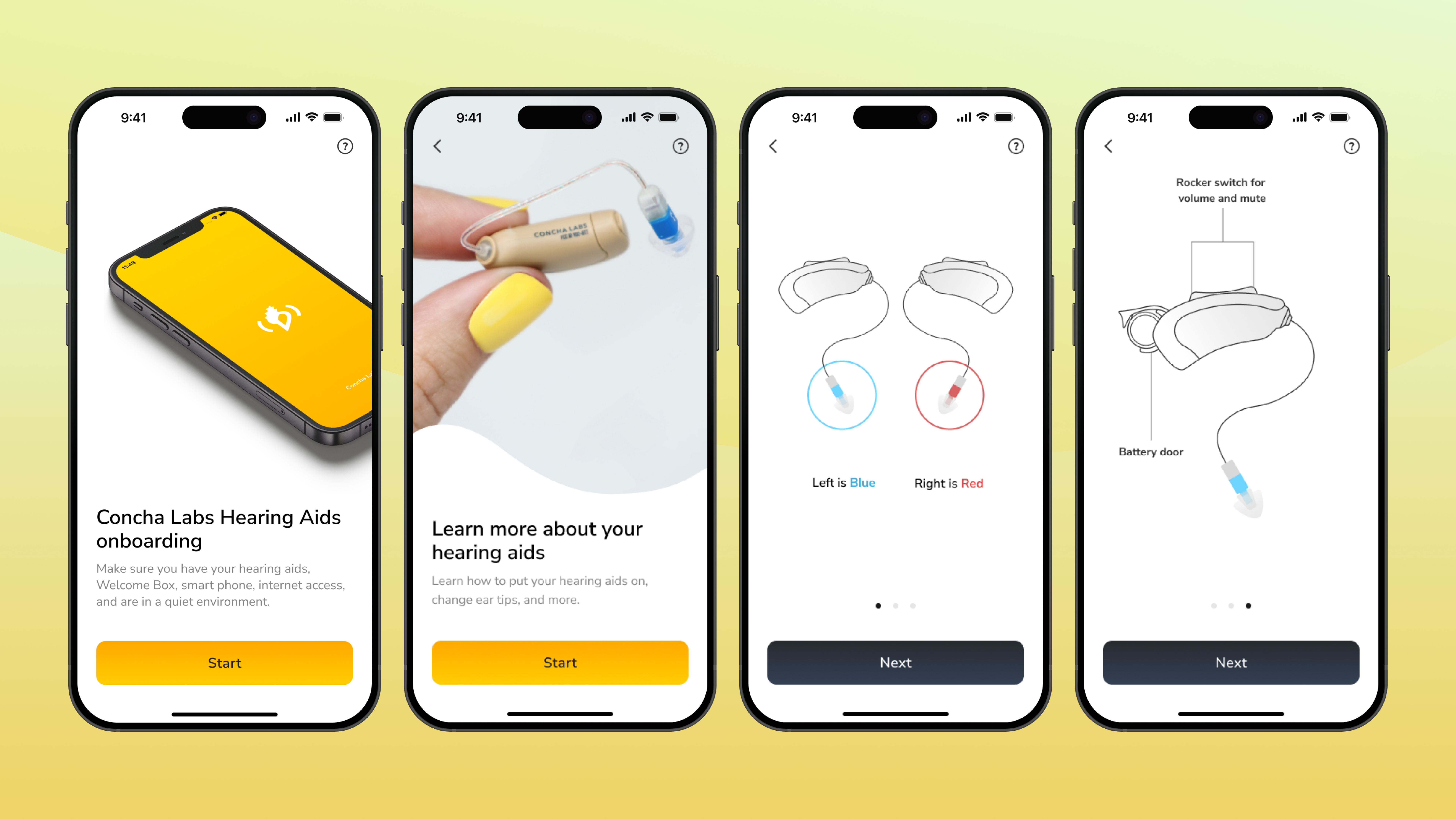
With the updates from beta testing and more internal testing, we were so excited to launch with this onboarding, as we wanted our users to have a good experience and be excited to use our app.

What’s next
We were excited to continue to explore more ways of making onboarding better for new users, but had to work on other projects in the meantime. In the future, I’m excited to develop more innovative features of the app, that allows for more personalisation and efficiency.
View the next case study
