Designing a sound profile system
Visual language and system for customized hearing aid sound profiles.
Concha Labs
Background and mission
The Concha Labs™ App is a hearing aid app that allows users to personalise their hearing straight from home. Our users must purchase our hearing aids, download the app, and then take Soundscope® in order to receive their personalised sound profiles. The hearing aids are Over-The-Counter (OTC) FDA approved.
This case studies focuses on collaborating with multiple teams, to develop product strategy in creating a system for sound profiles, so our users can have a customised way to hear clearly.
This case studies focuses on collaborating with multiple teams, to develop product strategy in creating a system for sound profiles, so our users can have a customised way to hear clearly.
Product development, handoff meeting, + brainstorming
Product development
Balancing short-term and long-term product thinking: This re-design of the app was a big project. I understood that we would be focused on solidifying the foundation of what our app is, but also that there may be more features and updates in the future.
Our product development flow looked something like this:
Our product development flow looked something like this:
- Handoff meeting
- Brainstorming
- Design
- Testing + refinement
- Launch

This is how the product development flow looked like for this project. While the basis is same for most projects, it really depends on the scope and details of the project itself!
![]()
These are the Android iterations of the Concha Labs Hearing Aids App. The concept of having to connect and disconnect each hearing aid separately in order to edit each sound profile was confusing and inefficient, and the visual language of the app was still unclear.
The problem
I was brought onto the team in 2021, in the beginning stages of the app and during the transition from creating an Android product to an iOS product. This change from Android to iOS was exciting and led to a re-conceptualisation of the entire app. With this opportunity to re-design the app, the main question we needed to resolve was:
For this project, we specifically needed to create a system for the concept of sound profiles. Some questions we needed to resolve were:
My overall responsibilities for this project were to:
*This case study will use an example of creating a linked sound profile as a primary focus (a linked sound profile is for both left and right ears)
- How do we design a medical app to ensure that it is approachable, efficient, and fosters trust with our users?
For this project, we specifically needed to create a system for the concept of sound profiles. Some questions we needed to resolve were:
-
How do we portray the concept of a “linked sound profile”?
- How do we highlight the different types of sound profiles that we have?
- And most importantly: How do we visually articulate, and create a system, for the concept of a sound profile, a new concept in the hearing space, that doesn’t exist?
My overall responsibilities for this project were to:
- Create a sound profile system.
- Visually transition the app from Android to iOS.
- Re-design our visual language.
*This case study will use an example of creating a linked sound profile as a primary focus (a linked sound profile is for both left and right ears)

These are the Android iterations of the Concha Labs Hearing Aids App. The concept of having to connect and disconnect each hearing aid separately in order to edit each sound profile was confusing and inefficient, and the visual language of the app was still unclear.
Handoff meeting
I led the product handoff meeting to learn more, take notes, and to ask questions for this project, with the Product Owners of our Marketing, Audio, iOS teams, and with the CEO. As Lead Product Designer, I both needed to know the possibilities, scope, and any long-term ideas that may impact design. Since I have hearing loss, I also participated in product strategy by testing these audio ideas.
Brainstorming
In order to design for short-term and long-term product thinking, it was important to gather the Product Owners to document all of their ideas, upcoming projects, and possibilities of what we could do. I would gather all of this information and determine the priority order, and then create action items from this list.
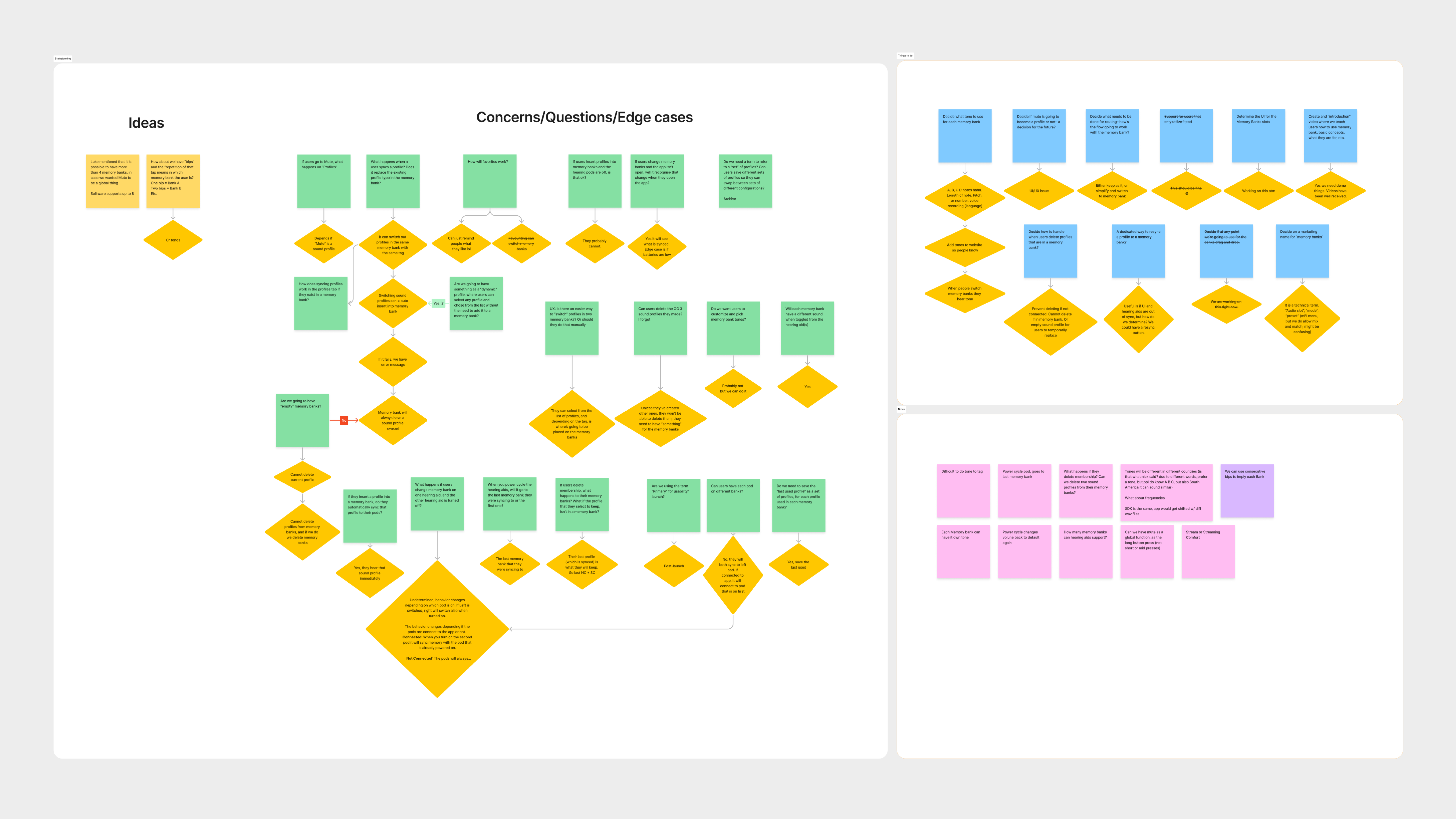
I led a brainstorming session to talk through this project. This often comprised of: Ideas, concerns, an action-item list, and notes.

We gathered the iOS team to discuss any ideas, concerns, and must-haves for this project.
Brainstorming (cont.)
It’s always important to me to bring our team together to ensure that everyone’s ideas are heard and considered. We also needed to ensure that the ideas that we had could be implemented.
Most of our decisions were determined by a few things:
- What the audio team was capable of engineering
- Our timeline to release our product.
My focus was to ensure that the basis of this sound profile system would be a solid foundation for any future updates, and that the way we designed this project would be confident and also modular.

After listening to the audio team’s detailing of the project, I created a short-term and long-term product timeline.
Brainstorming (cont.)
After a few rounds of brainstorming and internal research, I came up with a short-term and long-term product strategy. For this meeting, I created a table for definitions so we could all be consistent and on the same page. On the right, I created six paths for how this feature could look like, and highlighted the one we recommended. The green is the MVP phase, blue is the second update,and purple is the third update.
Over time, we all agreed that there would be three different sound profiles, and a mute state, all four inserted into the hearing aids’ memory banks:
Over time, we all agreed that there would be three different sound profiles, and a mute state, all four inserted into the hearing aids’ memory banks:
- Primary sound profile
-
Noise Comfort sound profile
-
Streaming Comfort sound profile
- Mute
Research
Audio research
What is a sound profile?
I collaborated with the audio team to understand what a sound profile is. I knew that users take Soundscope for each ear, to receive a set of parameters that allows them to hear. We call this a “sound profile”.
We determined that . It is essentially a prescription for your ears, to hear clearly.
What we came to also understand, is that the sound profile is the foundation of the app. Without the sound profile, the product would cease to exist, and our users would not be able to hear clearly.
I met with the audio team throughout the process to receive updates on the audio developments of the projects, further insights on how certain audio features will work, and feedback on designs. It was important for me to create designs that were modular, to attune for current needs and future needs of the product.
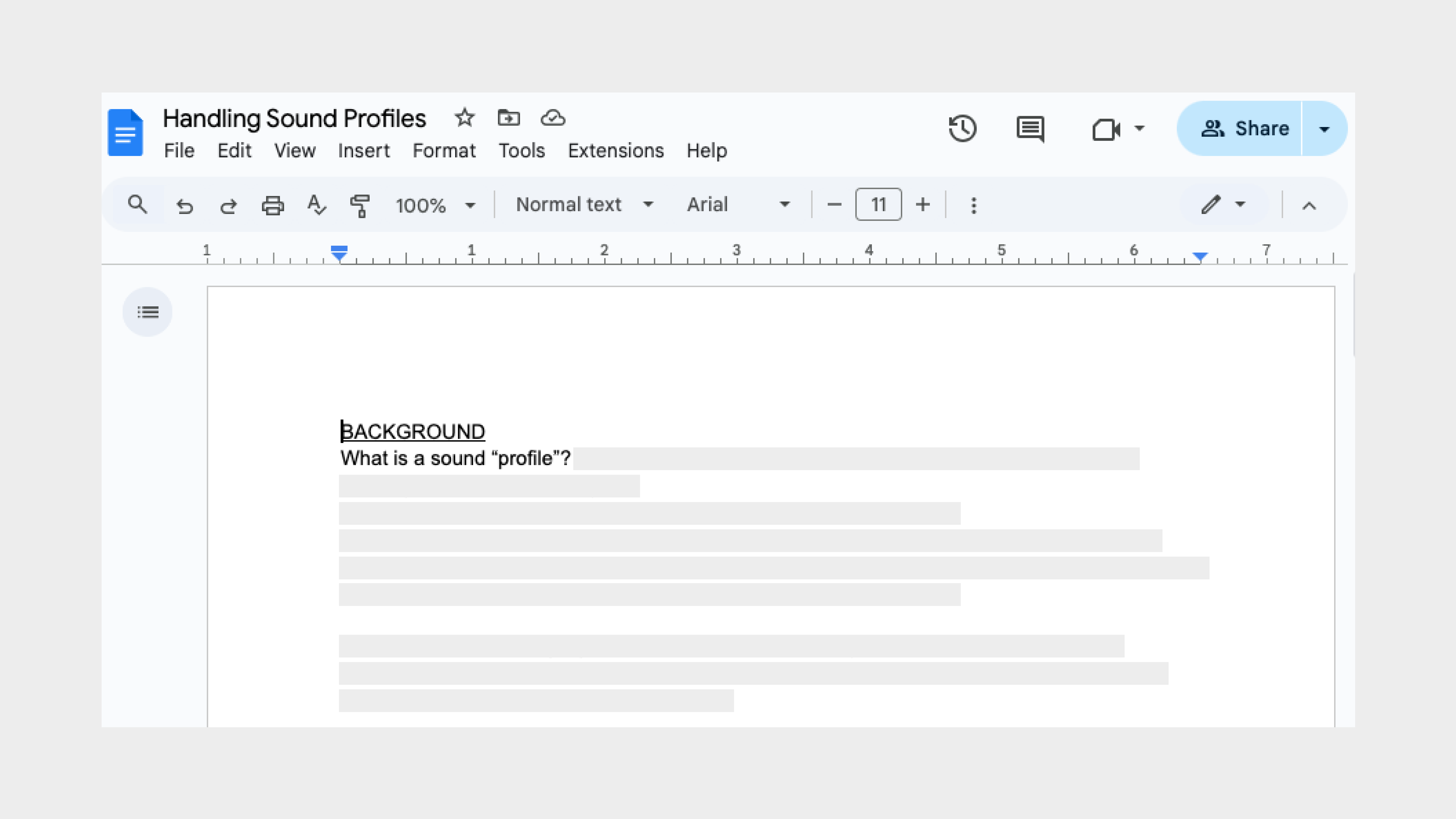
We worked with the audio team to understand what a sound profile is and how we can visually translate the concept in the app.
Hearing aid app research
With the basis of the project ready, we began to research current hearing aid apps on the market. During this research, I was quick to realise that all the hearing aid apps that we had access to study, had pre-set programs that audiologists often had to program into people’s hearing aids. Because the Concha Labs App is unique in that users do not have to go into an audiologist’s office and can take Soundscope® from home, there were few products we could reference off of the market.
We also noted that these designs were often outdated and not intuitive to use. This proved to be exciting as we had the opportunity to design our product from scratch, and to create something that doesn’t exist in the industry yet!
We also noted that these designs were often outdated and not intuitive to use. This proved to be exciting as we had the opportunity to design our product from scratch, and to create something that doesn’t exist in the industry yet!

Four examples of market hearing aid companies’ designs for audio programs. These apps did not allow unlimited sound profiles, and had pre-set settings/programs that one could not edit.
Music app research
It was helpful to study the hearing aid apps that were out on the market, even though they didn’t have the features that our app had. Moving forward, we looked at music apps to see how they organised and visually represented their audio files.
We found this research to be helpful, as while we cannot make any edits to songs themselves, there are many actions involved in music apps that can inform how we could design our product.
We found this research to be helpful, as while we cannot make any edits to songs themselves, there are many actions involved in music apps that can inform how we could design our product.
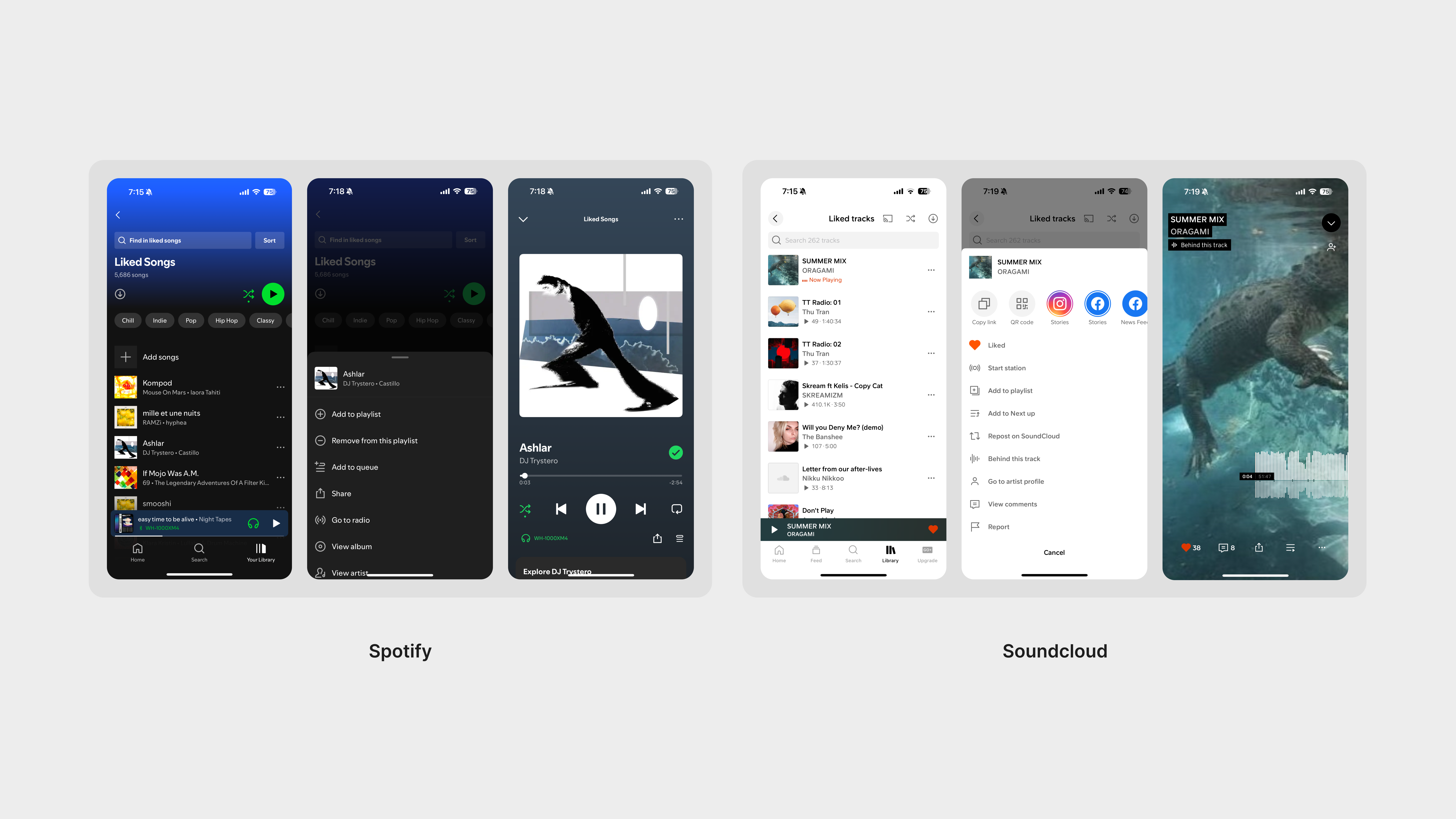
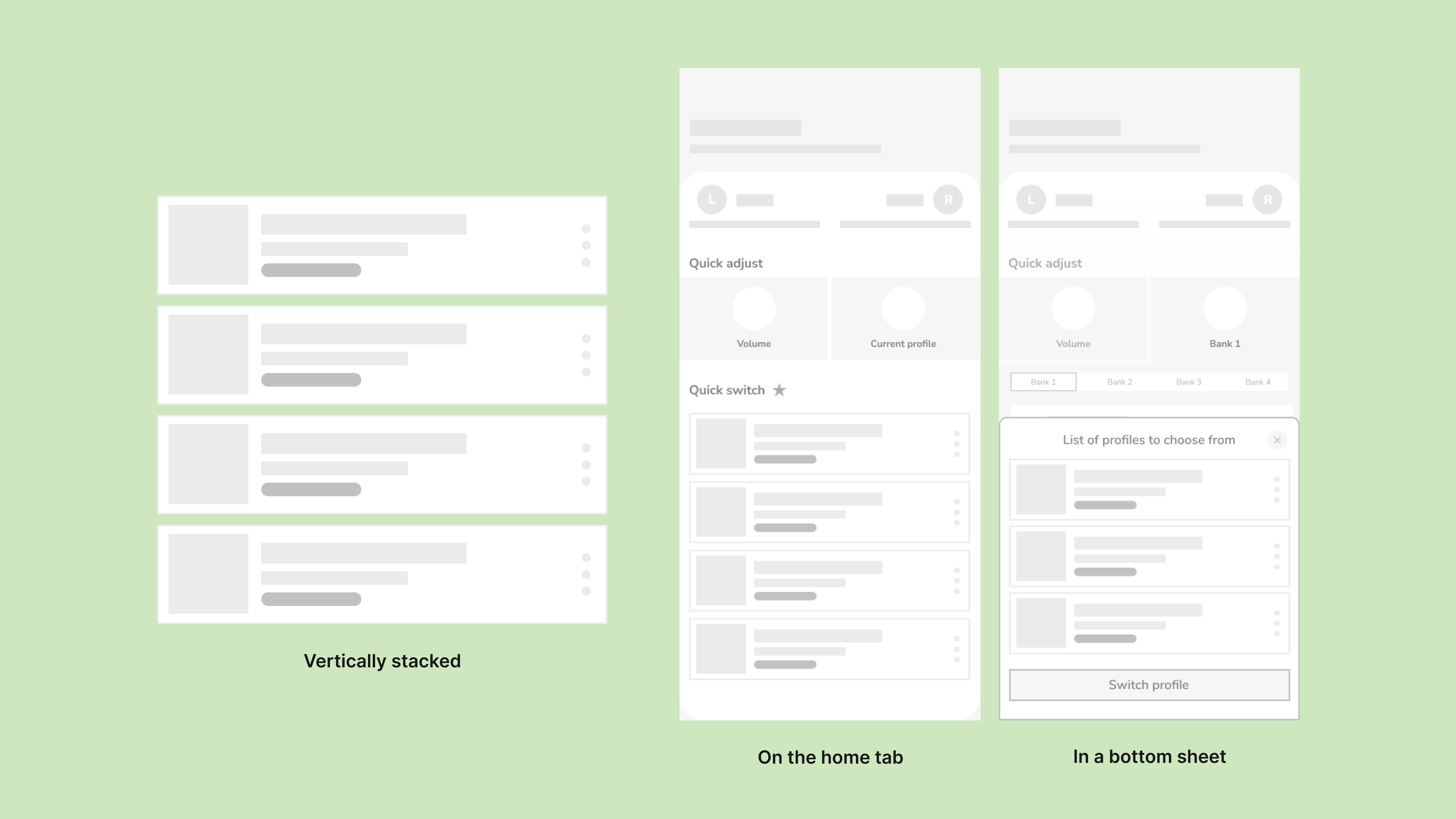
We noted that many music apps followed the concepts of: 1. Having a vertically stacked song library 2. Contextual menus and a bottom sheet for actions for each song 3. Individual screens for information dedicated to each song
Wireframing + Design
Understanding the project through design
Before beginning design, we had to make sure that we understood the audio aspects of the project before translating them into design. Here were some things that we knew we would have to integrate into this project:
- Four memory banks: Users can switch easily through four memory banks in their hearing aids. We can put any set of parameters in those memory banks.
- Mute functionality: This is helpful for if users need to mute but don’t want to take off their hearing aids.
- Sound profile variations: We knew that there would be different types of sound profiles eventually.
I began by designing for a basic sound profile first, since it was the foundation of the app. To do this, we had to understand the concept of a linked sound profile:
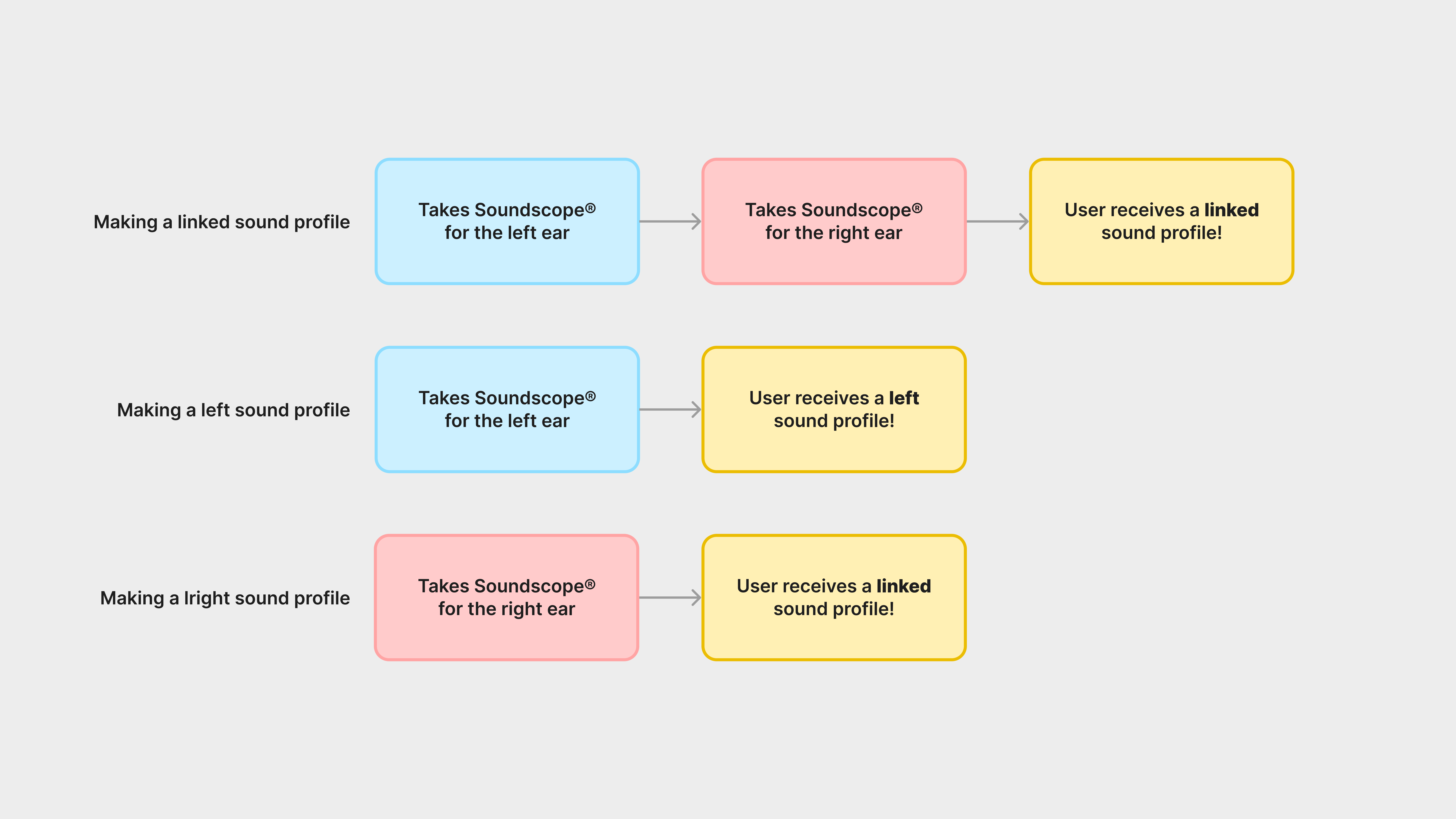
Essentially, a sound profile design must accommodate for being linked, left-only, or right-only.
Understanding the project through design (cont.)
During this process, we still collaborated with the iOS and audio team to work on features and learn updates to this project. Through this collaboration, we resolved the factors that we had previously, which were:
By combining all of these functionalities together, we created a feature that we called “Favorites.” Essentially, users will have have these sound profiles automatically slotted into their memory banks after taking Soundscope™, as well as Mute automatically slotted.
We also learned that the audio team decided that the three sound profile variations would be:
- Four memory banks
- Mute functionality
- Sound profile variations
By combining all of these functionalities together, we created a feature that we called “Favorites.” Essentially, users will have have these sound profiles automatically slotted into their memory banks after taking Soundscope™, as well as Mute automatically slotted.
We also learned that the audio team decided that the three sound profile variations would be:
-
Primary
-
Noise Comfort
- Streaming Comfort
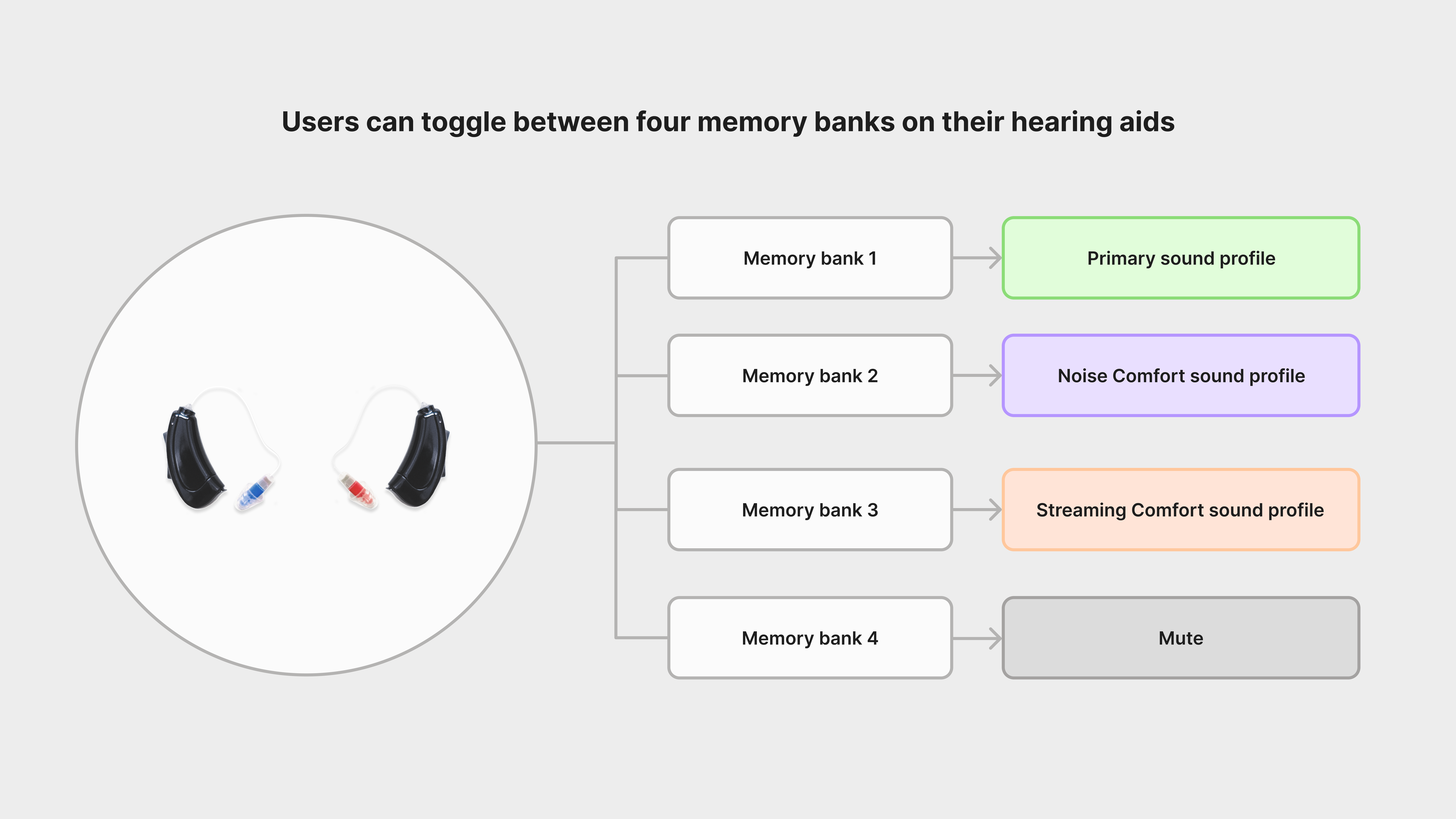
For this project, we knew that we could slot sound profiles into their memory banks. That way users can switch sound profiles easily with and without the app!
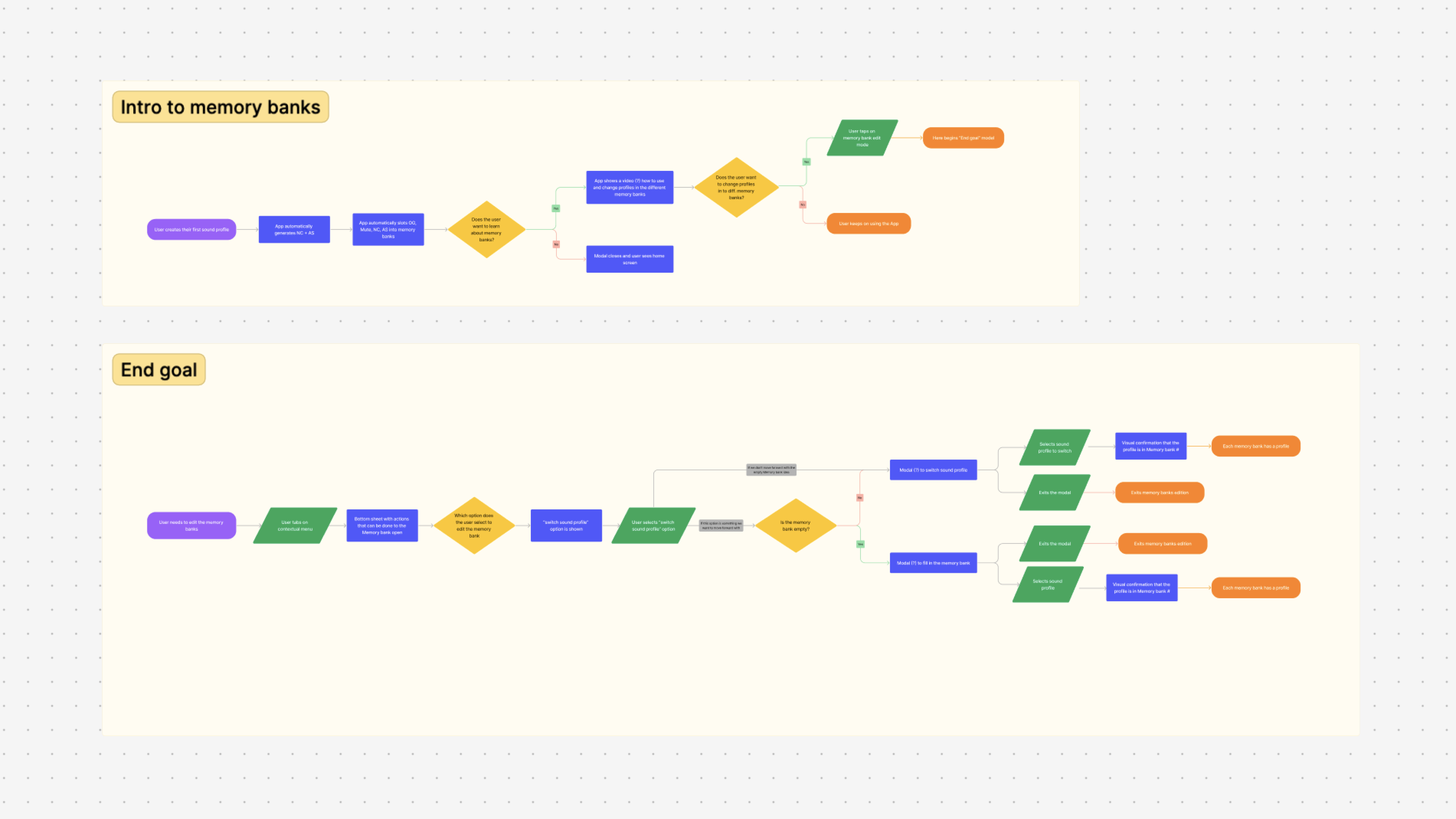
We discussed how “Favorites” would look like short-term and long-term.
Understanding the project through design (cont.)
Through discussing this feature with the teams, I knew that we needed some sort of visual indication on the sound profile, to show that sound profile was either
It was clear to me that we needed some sort of tag or mode indicator!
- In a Favorite (previous called memory bank)
- A sound profile variation
- Muted or not muted
It was clear to me that we needed some sort of tag or mode indicator!
Wireframing
The Android designs accommodated for engaging with the left and right hearing aid separately, which led to long and laborious processes such as onboarding or pairing the devices.
After the transition to iOS, the iOS engineers developed a way to internally link the hearing aids, which made using the app much more efficient and quick.
Before diving into the complete redesign of the app from Android to iOS, I worked on a few iterations and wireframes of what this system could look like. These ideas were never implemented, but were helpful in solidifying our product strategy.

During our time designing for Android, we had a few changes to the app that led to quick re-designs of the sound profile and the sound profile library. These ideas were never implemented, and these designs were drafts.
Wireframing (cont.)
As the concept of our product became clearer, we were able to create the fundamentals of how we believed a sound profile to both look and be utilised. We understood that the sound profile component must have:
I studied what music and audio-based apps were doing to see what worked for them, and what we could take inspiration from, in order to build the foundational wireframe for our sound profile.
- A visual element anchored to the left to display whether the sound profile is a left, right, or both left and right sound profile.
- The sound profile name
-
Date of creation
- Contextual menu for actions
- A section for tags
I studied what music and audio-based apps were doing to see what worked for them, and what we could take inspiration from, in order to build the foundational wireframe for our sound profile.
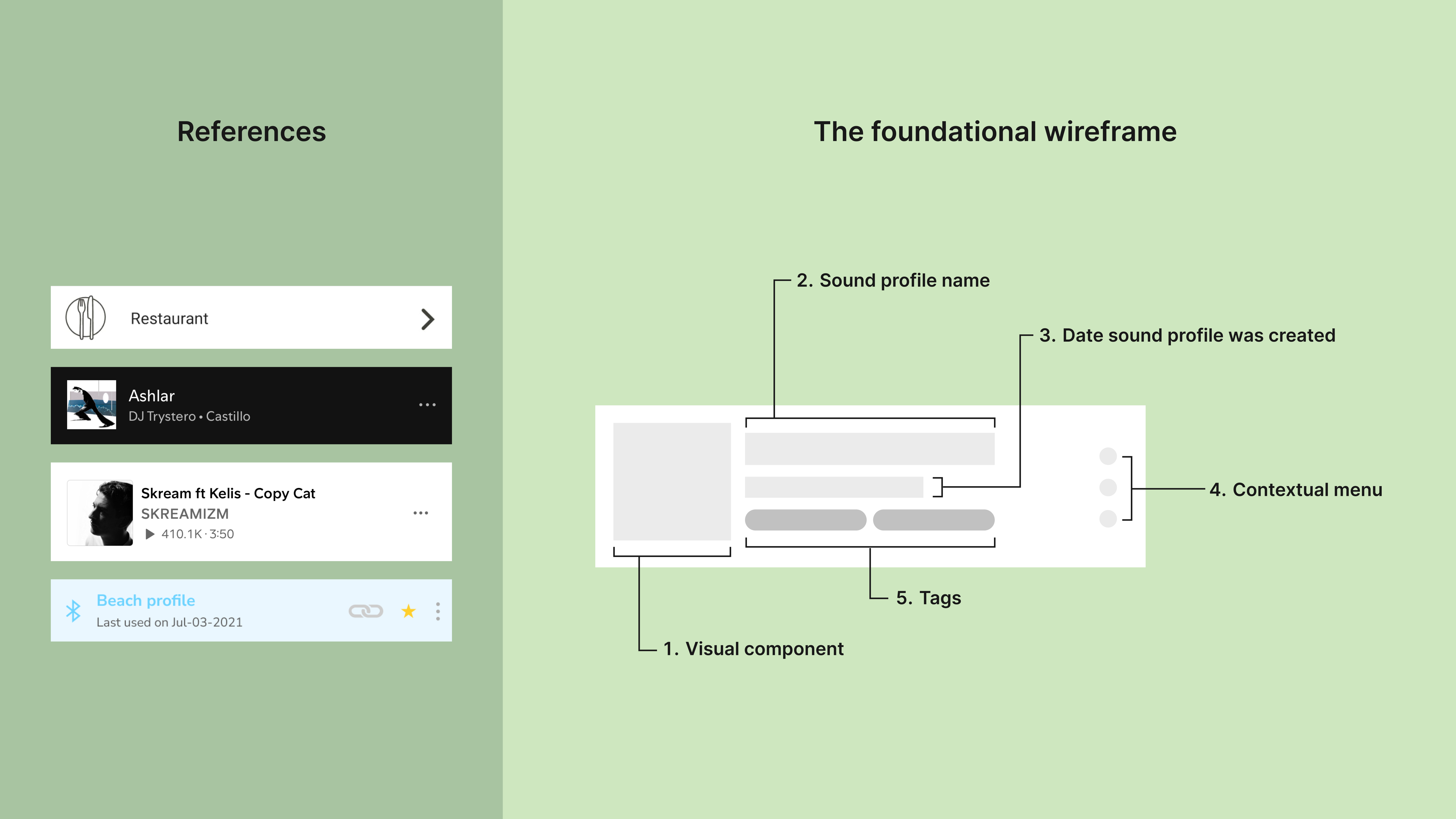
By looking at our research and own iterations of similar concepts, we determined a foundation for the concept of a “sound profile.”
Wireframing is one of my favourite parts of the design process! I got to play with different ideas and see how the designs will work.
Wireframing (cont.)
Once I got the foundation of the wireframe completed, I played with how the sound profiles would look like in context. I knew that we would have the sound profiles in three areas (minimum!):
1. In the sound profile library
2. In a memory bank feature that would eventually be called “Favorites”
3. In bottom sheet modals for another feature
It was important that the sound profiles exist naturally in all of these spaces. What may look good solo, may not look good stacked or in other contexts!
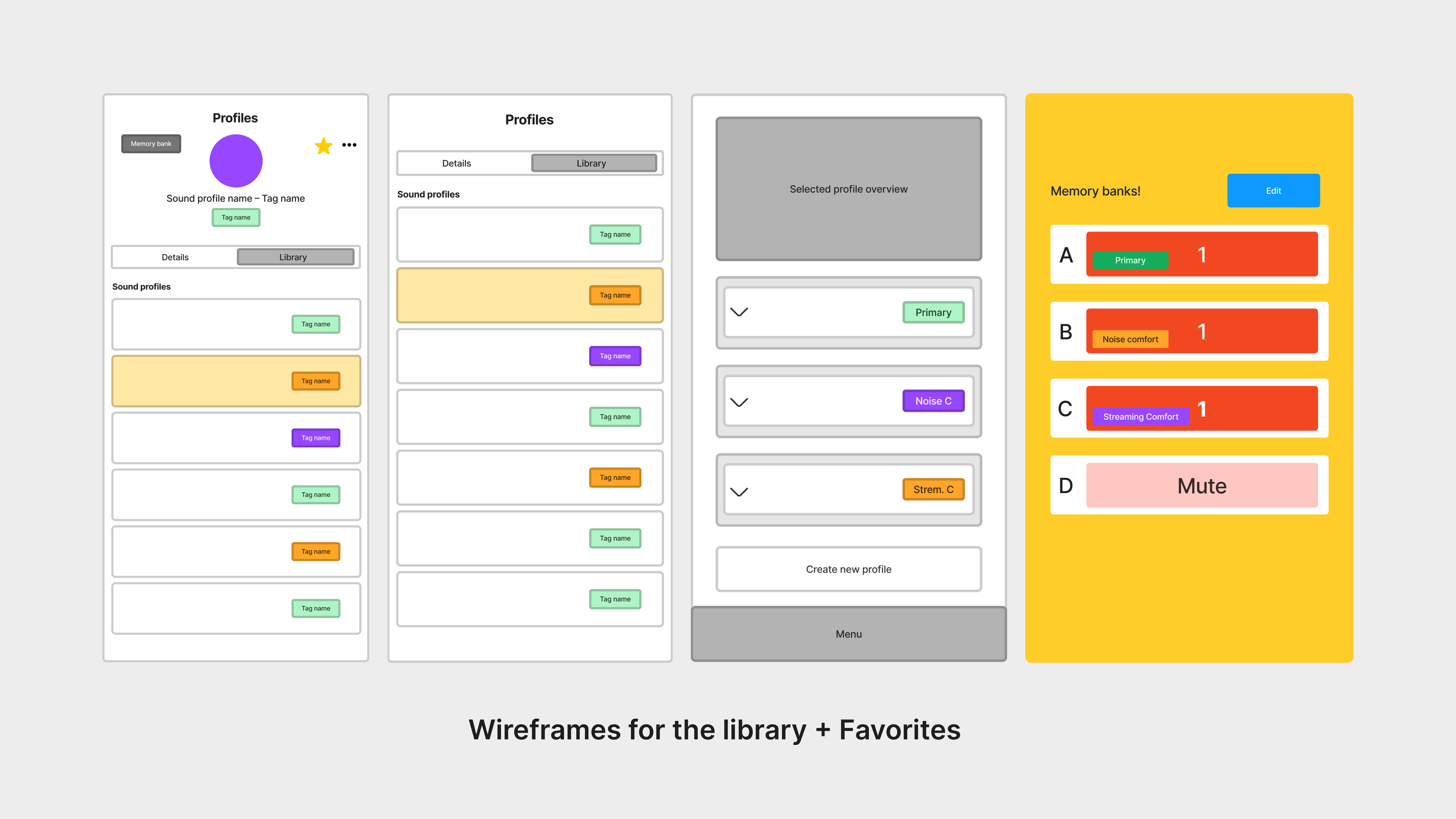
It was important that the sound profile would be modular throughout the app, so we wireframed how this would look like.
Wireframing (cont.)
While we had a brief idea of what the sound profiles would look like in the app, we wireframed these ideas to make sure that they would work. The biggest concern was making sure that the sound profiles would be understood by users in our Favorites feature (more on this later in the case study!).
Design the sound profile
With this foundational wireframe, I took this and began iterating. We maintained the concept of the sound profile existing as a card, as we knew we would need the sound profile in three states:
I also knew that this design had to be modular for our Favorites feature as well.
-
Not-synced: In-active, users are not using the sound profile.
-
Synced: Active, users are currently using the sound profile.
- Selected: When the sound profile has been selected by the user.
I also knew that this design had to be modular for our Favorites feature as well.
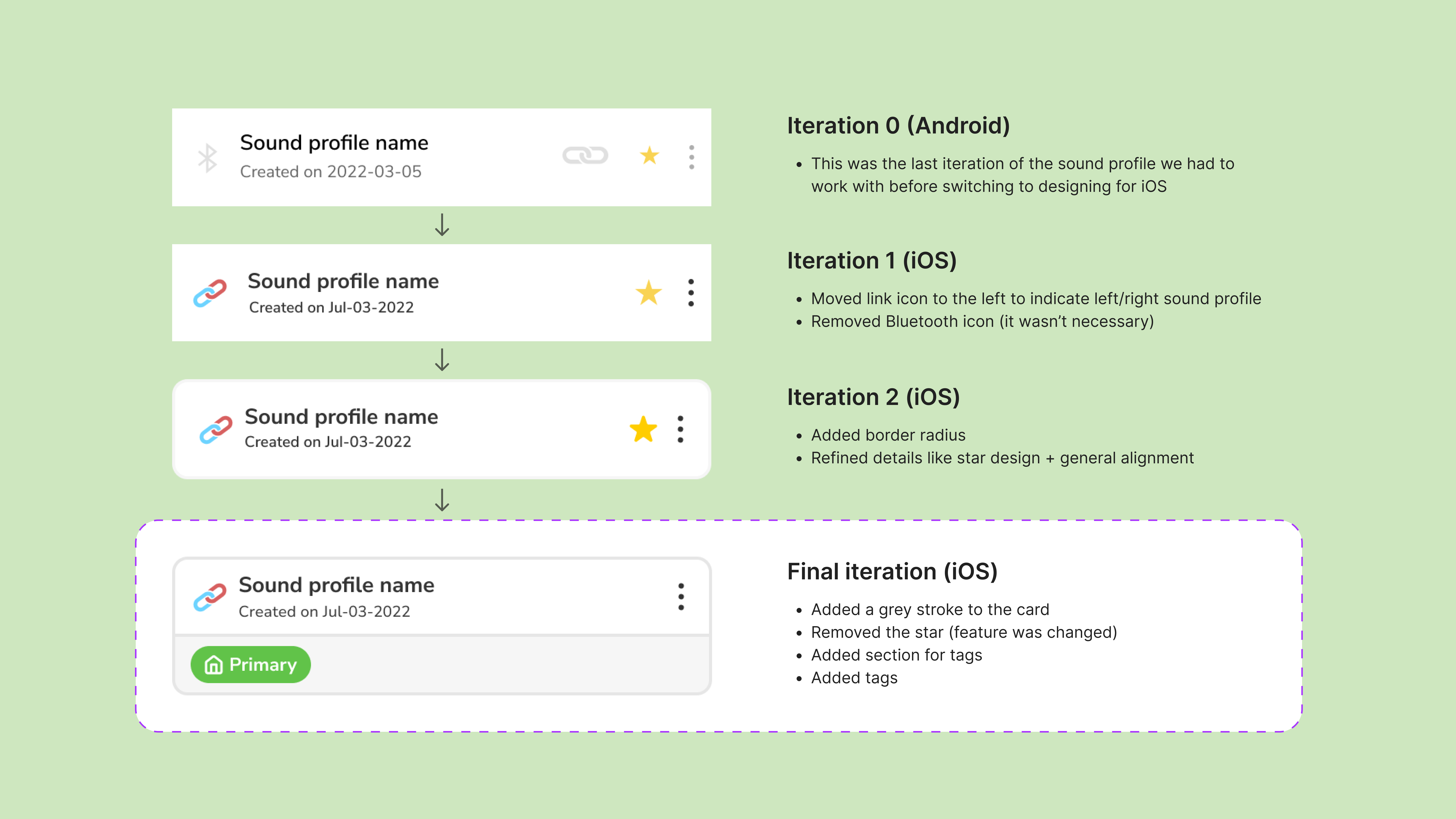
By making minor adjustments to the design, we ended up with something that we made sense!
![]()
I vertically stacked the sound profiles and put them in context of the app to see how they worked.
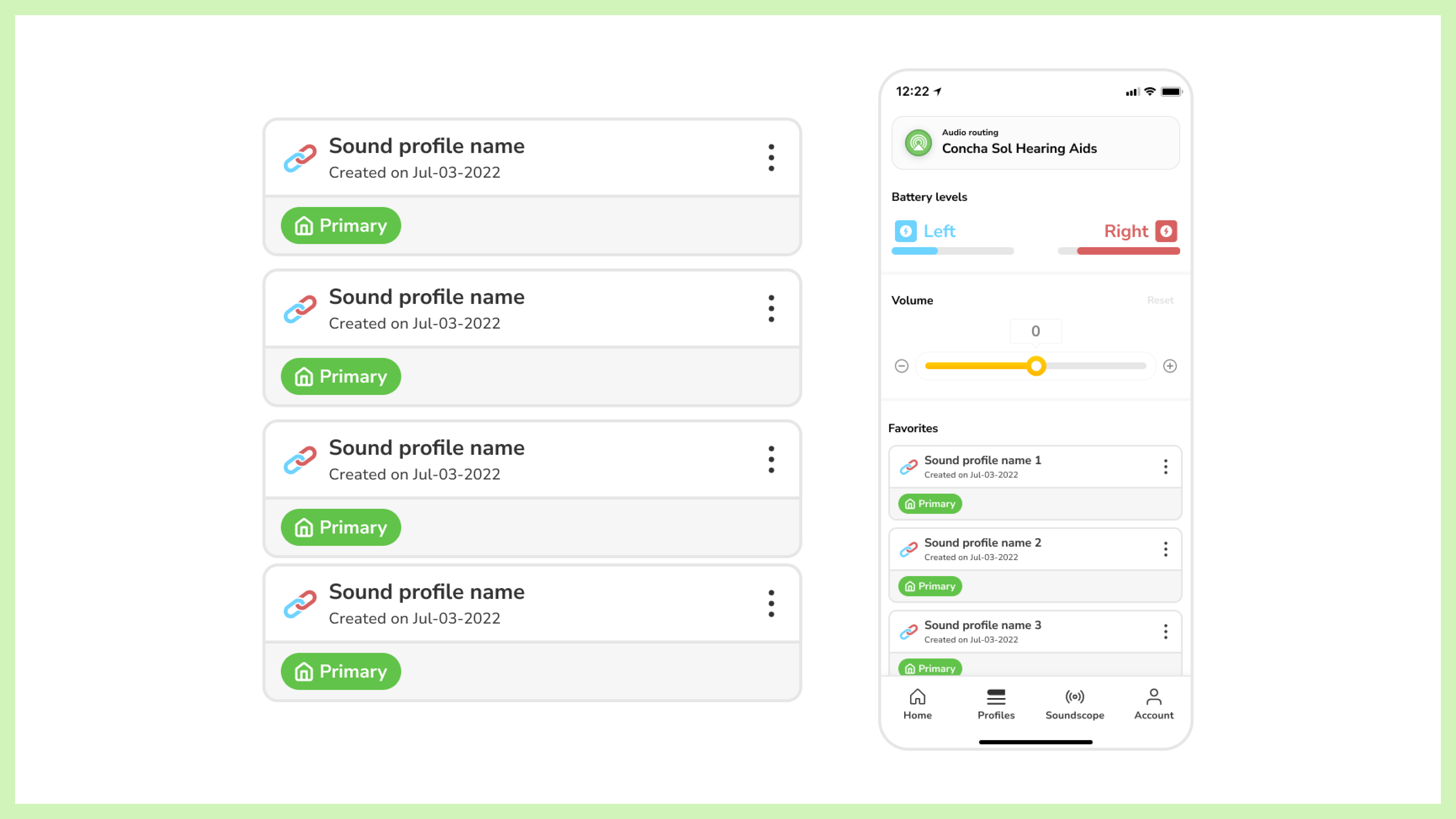
I vertically stacked the sound profiles and put them in context of the app to see how they worked.
Design the sound profile (cont.)
Since we created the basis of the design, we needed to make some variants of it:
- Linked, Left-only, and right-only sound profiles: To indicate if the sound profile is only a left, only a right, or both a left and right sound profile.
-
Sound profile mode tags: To indicate which mode the sound profile is.
-
States: To visually represent if the sound profile is currently being synced, not synced, or selected.
- Modes: Light and dark modes.

There are a few elements at play, so I separated the sound profile by top and bottom to indicate different variables. We chose green, purple, and orange as our tag colours, to make a clear distinction as blue, red, and yellow are already our hearing aid and brand colours.
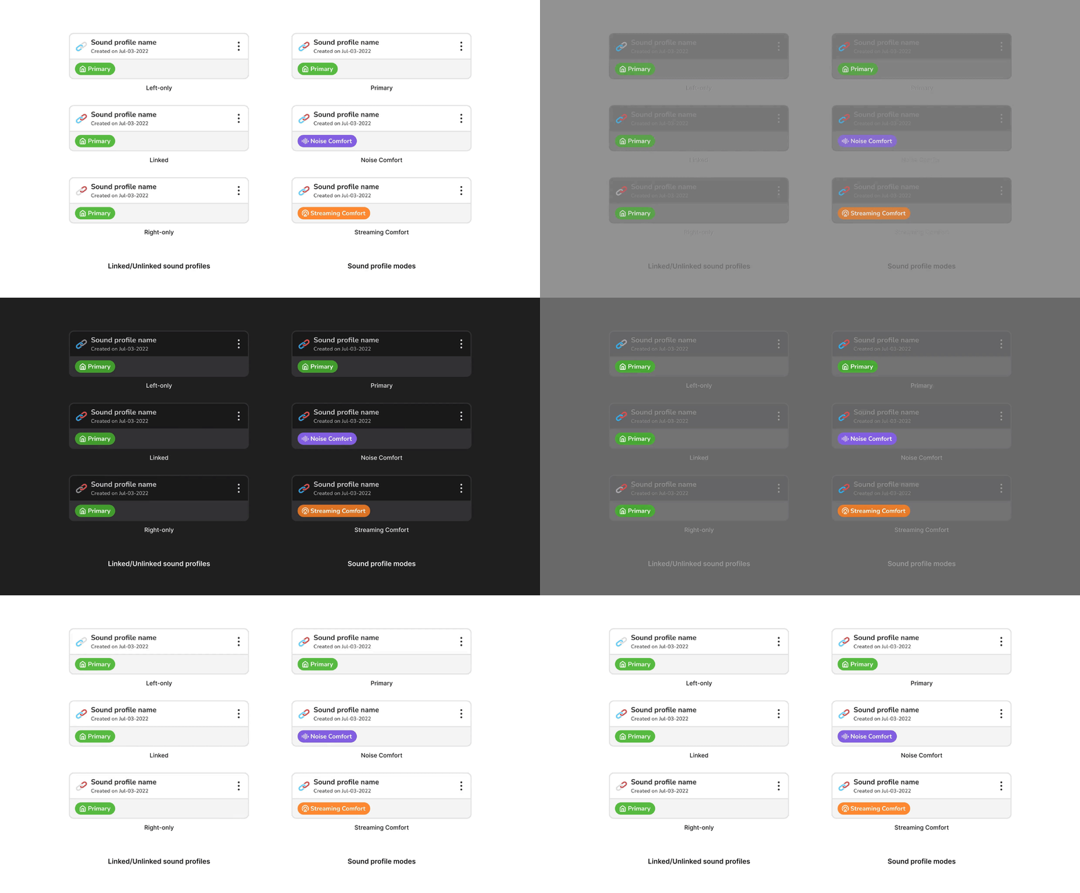
Sofía Díaz Mendiburu worked on light and dark mode for our components. She did an amazing job!
Design the sound profile (cont.)
To build our our state variants, I went back to the wireframes to build out how the various states looked like stacked. I knew we needed our users to see what sound profile was already synced (active state), and if they were to switch sound profiles, they would have to select.
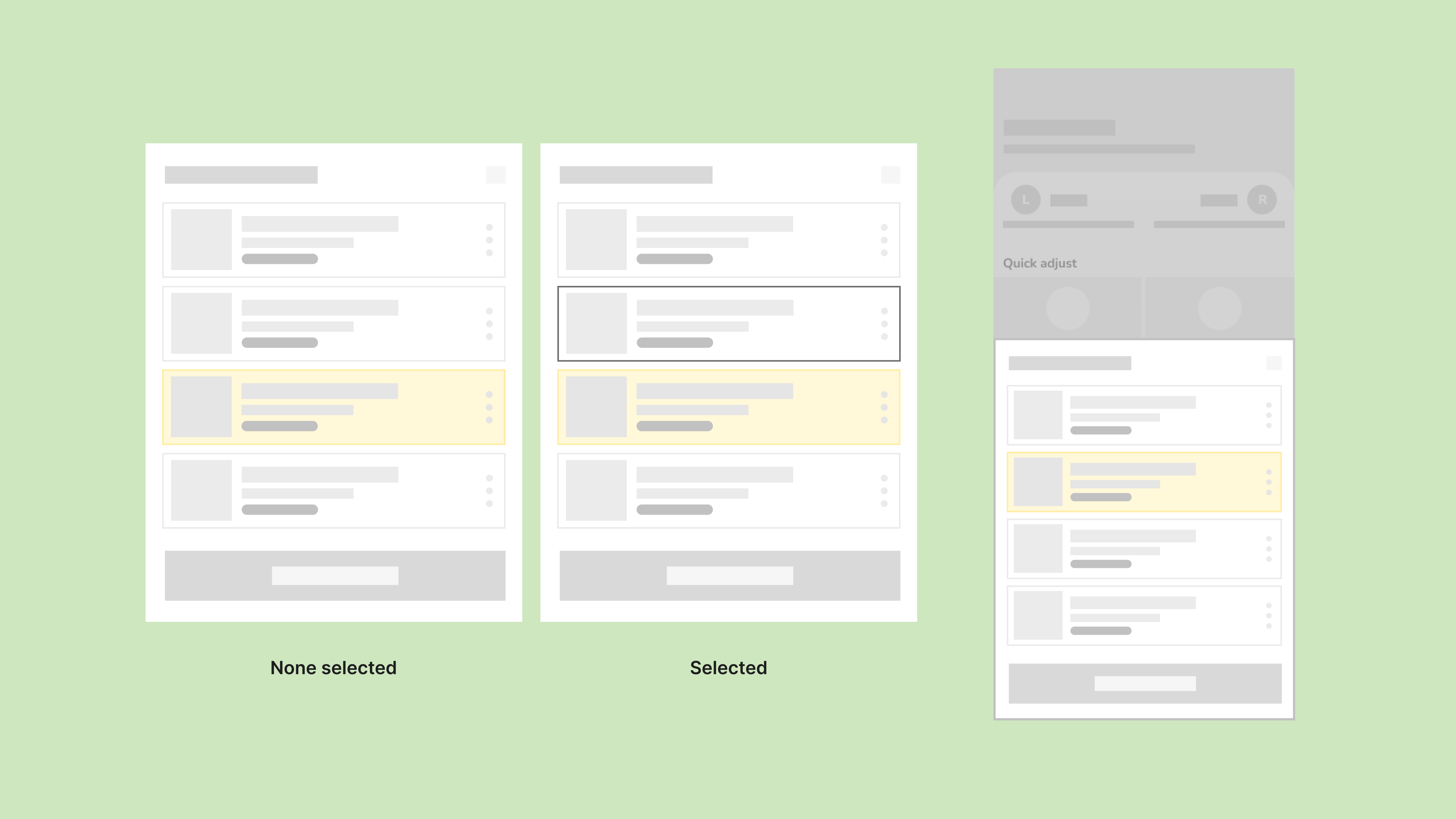
I used yellow (our brand colour) selectively as yellow can be hard to read. However, it works fine as an active state as filled colour!
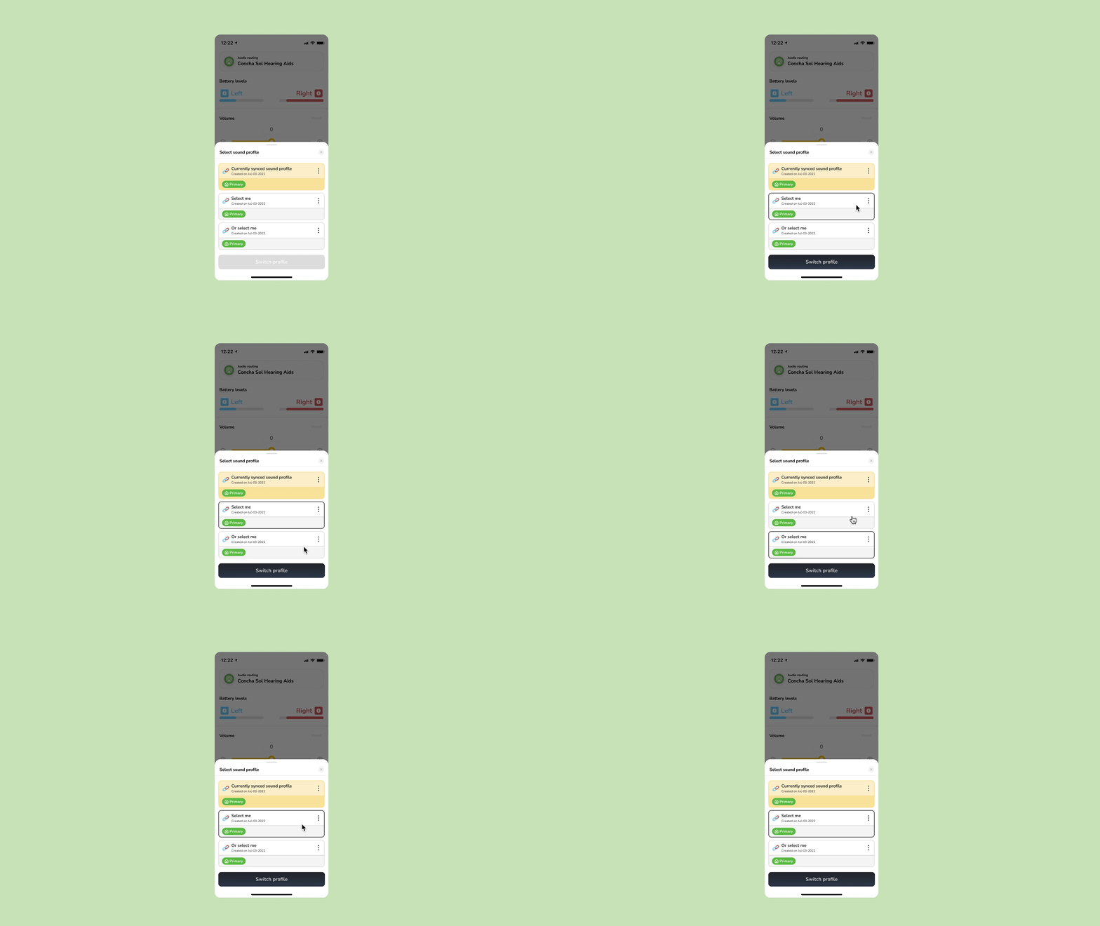
Designing the Favorites using sound profiles
Throughout this process, we knew that we would have to design for Favorites. While designing, we played with ideas for what this could look like, to ensure that our sound profile designs were modular. We needed a way to visually show people that:
According to our product meetings, we knew that the favorites may not always be fixed to their profile modes, so we also designed with these variables in mind!
For the Favorites feature specifically, we iterated as much as possible on how the sound profile would look like. This was important because we needed our users to know that these sound profiles were in the actual hardware of their hearing aids, and they could toggle between them without the app.
- There are four favorites, three for each profile mode and mute
- The favorites are fixed to their profile modes
According to our product meetings, we knew that the favorites may not always be fixed to their profile modes, so we also designed with these variables in mind!
For the Favorites feature specifically, we iterated as much as possible on how the sound profile would look like. This was important because we needed our users to know that these sound profiles were in the actual hardware of their hearing aids, and they could toggle between them without the app.

It was important to try out different ideas to see what worked best! This project took about three years and saw many iterations of other projects in the works.
Designing the Favorites using sound profiles (cont.)
The nature of the work we
did involved a lot of communication and collaboration with the audio team, as they worked on engineering a feature. We worked with them to continue to understand the audio aspect of the project, as we felt that we could incorporate themes and approaches into the way we designed.
When the audio team mentioned that the Favorites were like “slotting a sound profile into a memory bank”, we immediately thought of matchboxes and began iterating.
When the audio team mentioned that the Favorites were like “slotting a sound profile into a memory bank”, we immediately thought of matchboxes and began iterating.
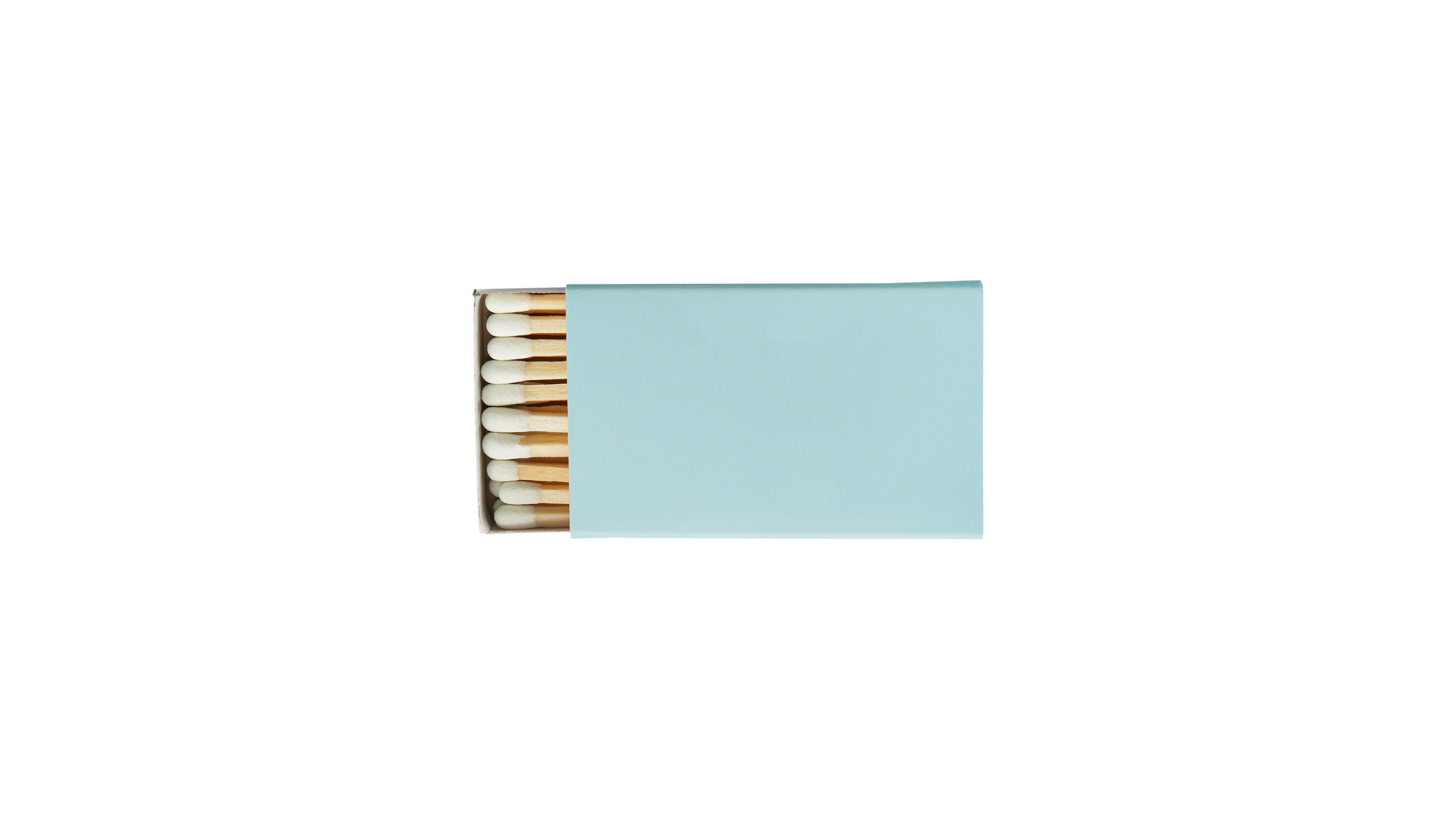
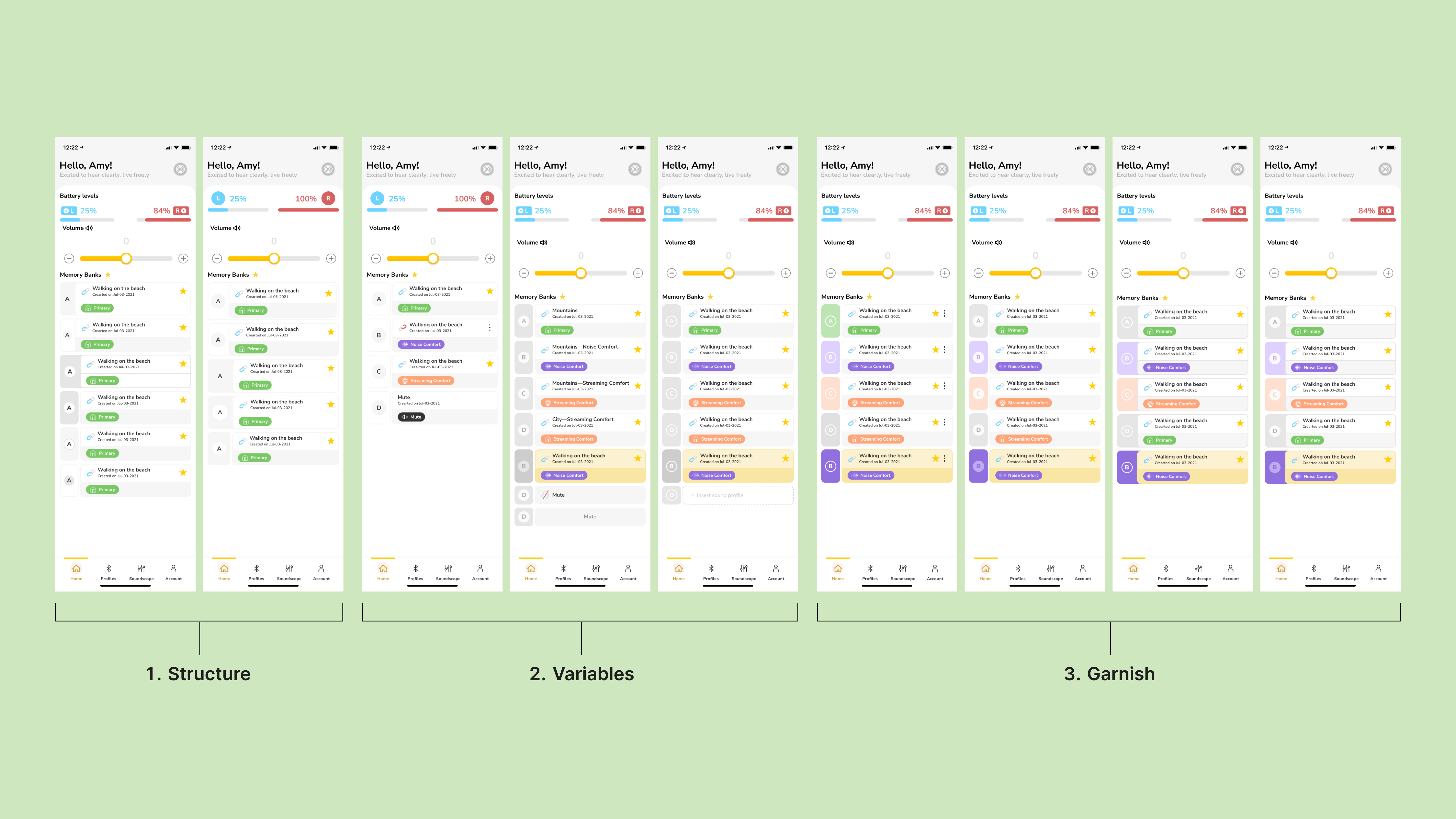
Sofi and I iterated on the Favorites designs for a while. It was important to try out as many options as possible.
Designing the Favorites using sound profiles (cont.)
When iterating, I used three steps for this project:
At times I work all three at the same time as one idea can often influence another (and I like to capture the ideas immediately) but in general this order works best.
- Structure: Before thinking about any other garnishes, we needed to work on a structure of the design that worked best.
-
Variables: In our case, we had to design for three sound profile modes and mute. It was important to consider this and many questions came up (what order should they be in, what do we call them, etc?)
- Garnish: Design with maximalism in mind, to try everything possible!
At times I work all three at the same time as one idea can often influence another (and I like to capture the ideas immediately) but in general this order works best.
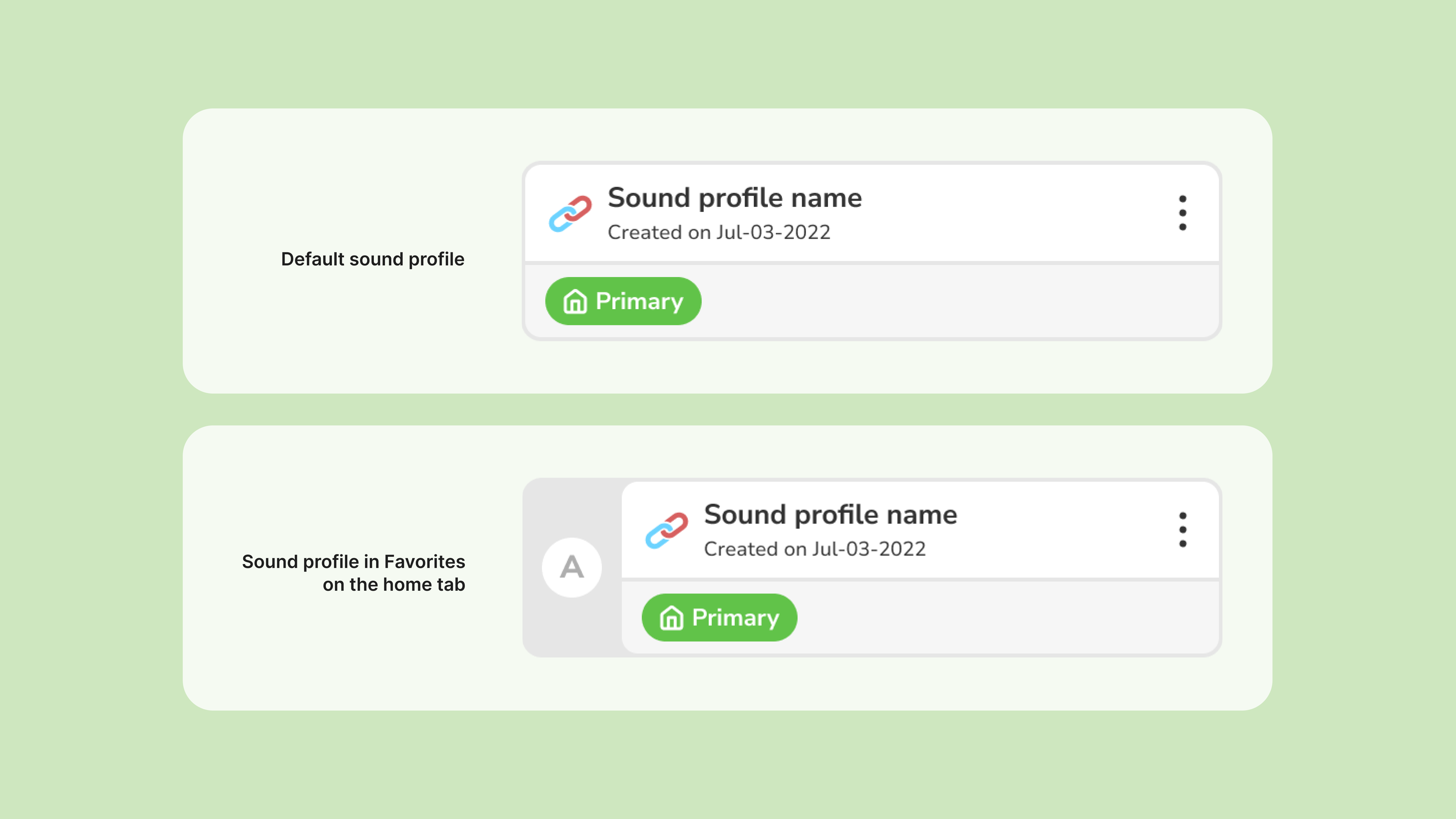
The solution ended up being quite simple, but we were glad we went through all the iterations!

We created Favorites tags because we needed two visual way to represent that a sound profile is in a Favorite.
The final designs
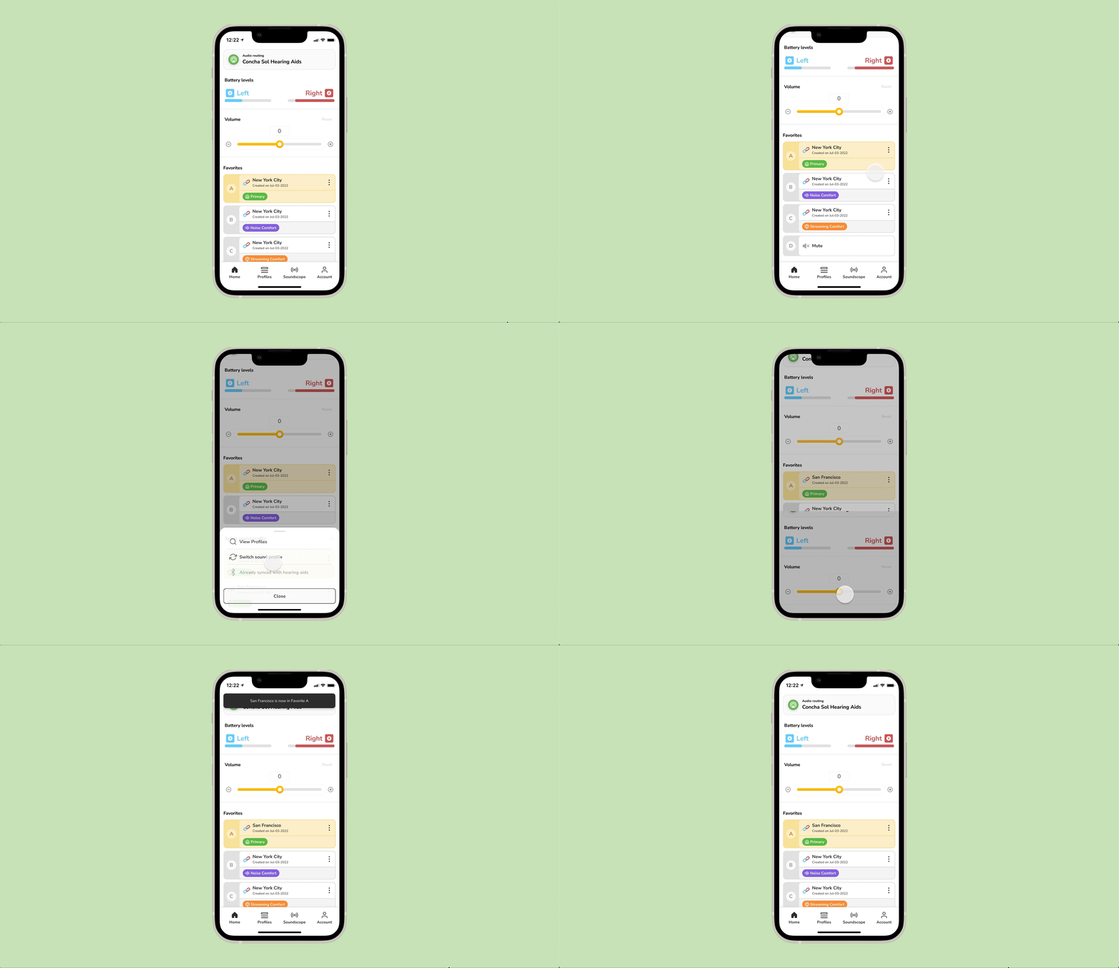
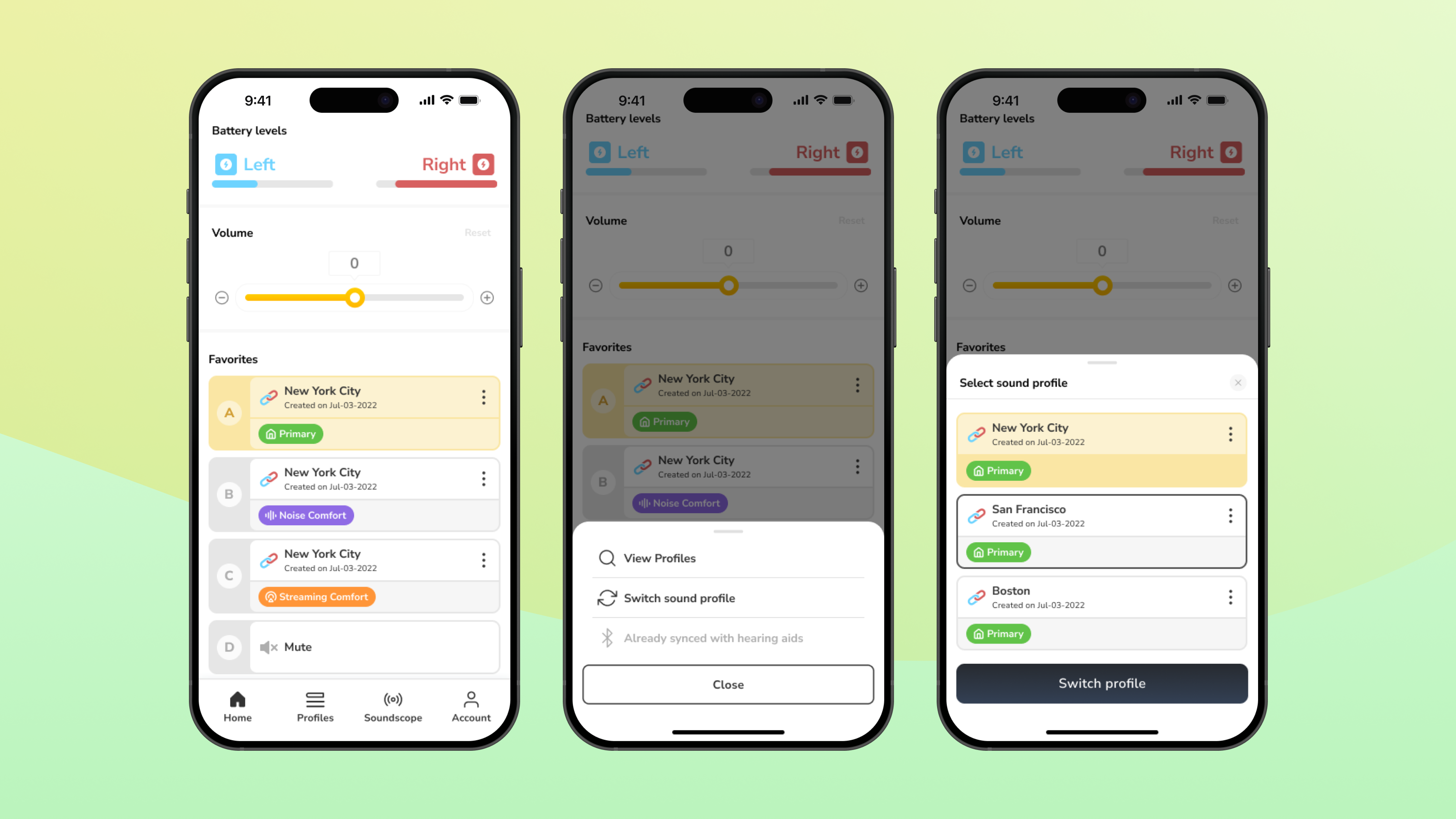
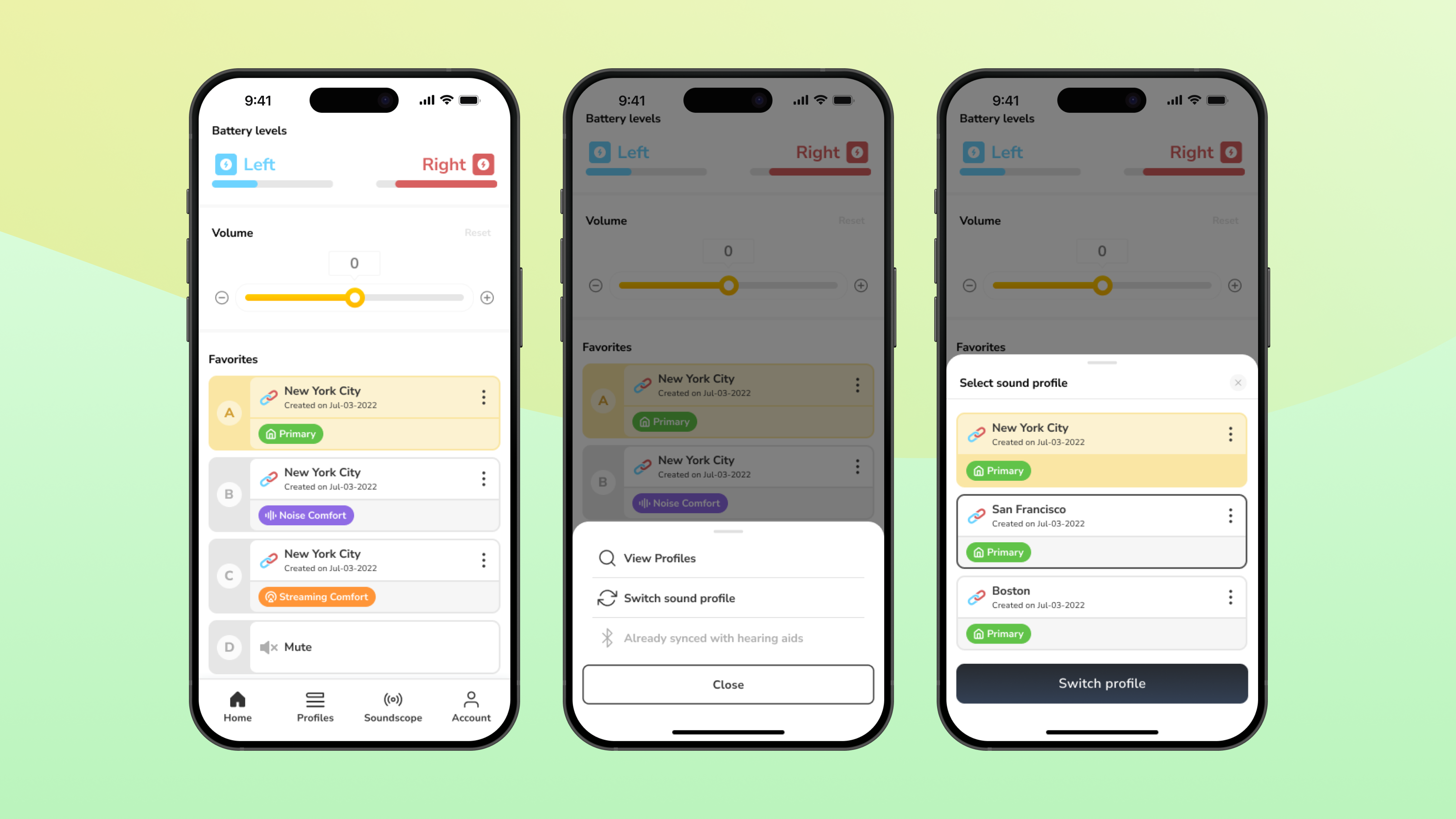
The user flow for switching a Primary sound profile in a Favorites A. This feature lives on the home tab, whic his meant to be a dashboard for quick access.
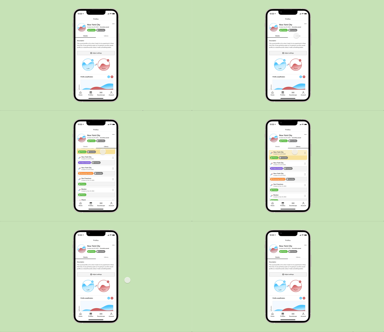
Sound profile details and library on the Profiles tab.
![]()
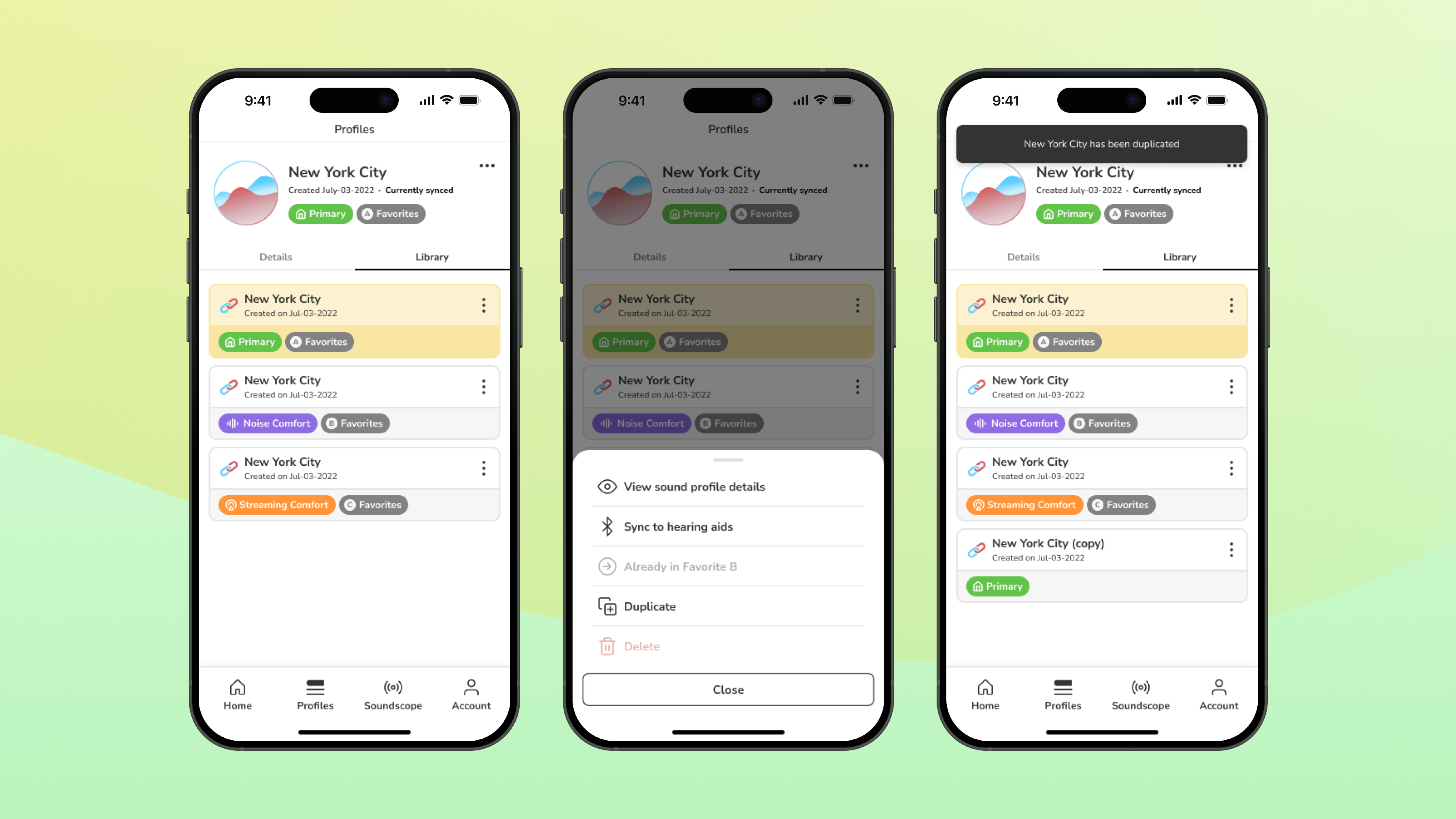

Duplicating a sound profile.
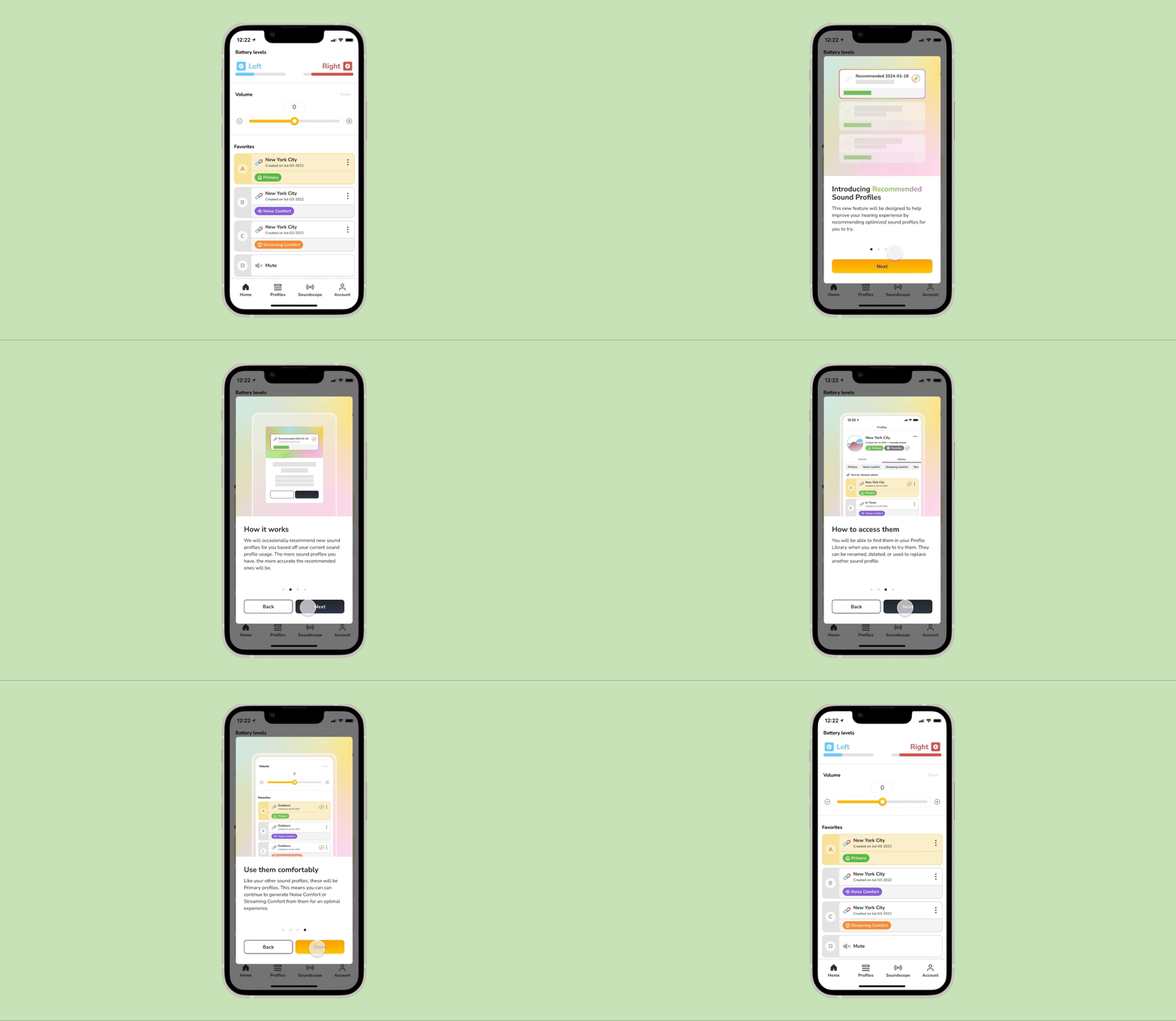
What next?
We played with the idea of, and even designed for some ideas that we were saving for the next release. These ideas we accounted for were:
Since we had to submit our finished app for FDA testing, we saved these ideas for a next release of the app.
- Density: Compact, Default, and Comfort mode:
-
Filtering system: To sort alphabetically, date created, etc.
- Recommended sound profiles: Sound profiles recommended by AI, or by our personal audiologist!
Since we had to submit our finished app for FDA testing, we saved these ideas for a next release of the app.
View the next case study